Search This Blog

Wednesday 30 June 2010

Freebie Mag Papers and Cardstuff ....

What do you do with the freebie mag papers you pick up?  I wouldn't dream of using them for layouts (because they're shiny, and look like freebie mag papers, :lol:) but I use them all the time for making cards. 

Now that I've mentioned freebie mag papers, the first two cards don't use them at all!  :lol:  But they do use up scraps and old stash, as is my norm.  Dear viewers, you will get heartily sick of me saying that!  It is the truth, the whole truth, and nothing but the truth, m'lud. 

Using up the aperture cards my friend Tara gave me, and some thick vellum cutesy images my friend Judith gave me about six years ago.  I've got heaps more!  I've actually coloured in the images with promarkers, but the result is very subtle - perhaps because of the thickness of the vellum? 


I actually don't like cute images - or at least, certainly not the Magnolias or Tildas or whatever is all the rage at the moment.  But I will use whatever I have, so here is the result.  And it is cute, at least.  Flowers are American Crafts Greenhouse, which I have been saving - they're perfect here, I think. 


Two scraps of patterned paper - and that's almost it!  Honestly, I don't scavenge - but people give me things they won't use ALL the time.  My friend Moira gave me some Papermania ribbons - the purple and the orange were part of the set.  The purple dotted paper is Basic Grey Fusion and the floral is a scrap of DCWV (I think) that one of my students was going to throw away from a class.  Tut!  So simple, but I love the really bright colours. 

NOW onto the freebie mag papers!  I picked up the Scrapbook Magazine, which I don't do very often, and the papers are by American Crafts - one is a heritage range, and one is a sweet range? 


Again, more Papermania ribbon, some stamping and bling and done! The pink lifts up the blue and adds some fun, I think. 

More of the same background paper - a twist with a curvy message by Craftwork Cards.  I really like the curvy messages now! 


Same ribbon, many of the same elements - but a different result.  The pink adds lots of zing, but also makes it very feminine, I suppose.  They were supposed to be masculine cards at the start! 

This last one is quite formal, but I believe the message makes it quite versatile. 


The gold stickles add real impact IRL - just a dotting around the journalling frame and between the Martha Stewart Loopy punch edge and the gold ribbon.  I really like the message "celebrate in style" - it could equally apply to birthdays, anniversaries, good news in general, or exam results!  A very satisfying feeling to use up what most people throw away without thought. 

Tuesday 29 June 2010

Friday ellies Stampeding through the West

Last Friday, 18th June, I was exploring around the West.  I had an appointment early Friday afternoon and managed to capture a couple of ellies before heading back to work.  Here's two ellies who were resting in Sloane Square:


This beautiful elephant named Kingdom, #208 was created by Rebecca Campbell.  Artist's Inspiration: "Strutting peacocks, prowling tigers, dancing cranes and even dung beetles going about their daily business. "Kingdom" is a celebration of some of the birds, plants and animals that share the Asian elephant's domain."


And here's Josephine - #190, created by Patrice Moor.  Artist's Inspiration: "I am passionate about tulips and much of my childhood was spent in Holland (my mother is Dutch)". 


Turn left into King's Road, to encounter more!  No prizes for this one's name - but for documentation purposes, it is #13, Doors.   The artist is Ratchadapol Mueannoo.  This elephant was kindly sponsored by Savills.


The Duke of York Square is right off King's Road and is rather large!  It goes on for a couple of blocks. 

This next elephant is #59, named The Elephant In The Room was created by Anna Masters.  Artist's Inspiration: "My practice is heavily influenced by an investigation into pattern and form. The designs on the fabrics provided by my sponsor, OKA, provided fantastic inspiration for the elephant."  OKA retail furniture and home decor accessories.


Look at the legs - it's like she is wearing four different pyjama bottoms!  :lol:  Love it.  For this one, I am going to give you a 360, because the other orientation looks so completely different.  This is Duke of York Square. 


Sadly, I couldn't continue the hunt at that juncture ... I had to go back to work to fund the hunting!  So after work quite a bit later, I went home via Green Park. 


What a magnificent sight!  More to come ....

Monday 28 June 2010

Trafalgar Square...

Continuing on from my day Thursday before last, 17th June.  About 6pm, walking towards Trafalgar Square - I hadn't been there for ages up until then. 


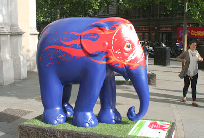
This elephant #144 named Kings XI Punjab was created by Lalit Modi.  Artist's Inspiration:"This elephant was inspired by the Kings XI Punjab, an Indian Premier League cricket team". 


This elephant #147, named Delhi Daredevils was created by Lalit Modi and is part of the same family of the Indian cricket team! 


Another one - #150 - Royal Challengers Bangalore - again by the same artist, Lalit Modi. 


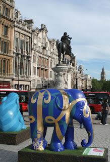
Right in the centre of the Square - #145 Mumbai Indians - the name of another Indian Premier League cricket team". 


I like the sunburst effect on this blue one!  This next one, #143, is very aptly named "Rajasthan Royals". 


Didn't quite mean to have a bus sticking out in this picture, but there you have it!  Another instance of inferior photography.  :lol:  #149, Chennai Super Kings. 


Here's the famous Square, in action .... and a lovely day to rest a moment, watching the crowds, and the blue sky ....


After a brief respite, onto Leicester Square.  This is the Tommy Hilfiger Red Elephant, #247.   Artist's Inspiration: "Inspired by popular culture, I combined red and green pop colors to design a high-gloss elephant with a Mohawk planter effect. This elephant is unique as it continues to evolve throughout the parade, while juxtaposing nature with the unexpected."


Loving the punk hairdo!  At this point, I am in Theatreland proper - round the corner, in St Martin's Court, is Figgy, #110.  Figgy was created by Hannah Griffiths and her inspiration - "Figs are a beautiful fruit and I love their lush colours and the gorgeous pattern of their leaves. I wanted to create a precious richness by adding a mosaic element to my elephant."


Very difficult to get that photo, even what it is - there were LOADS of people milling about - being a Friday night after work.  What a spectacular facade to that pub! 

I was so disappointed when I got to Leicester Square to see it all partitioned off - they were preparing for about 50-60 of the ellies to be together in Leicester Square the next day - but that didn't suit me!  (Spitting dummy there .... :lol:) This was the only ellie I could get in Leicester Square - and that is by leaning over the partition.  No 126 - Untitled (Gajaraja) - created by Jitish Kallat.  I was quite amazed to see how many of the ellies were actually unnamed - it's a wonder they didn't do names out of the hat, or something of the like! 


I decided to wend my weary way home, but on the way, ran into one more elephant - this time, on Jermyn Street.  #200, Dickinson Elephant and one of my favourites.  This beautiful elephant named Dickinson Elephant was created by Phoebe Dickinson.  Artist's Inspiration: "Great Flower paintings associated with Dickinson; from Old masters to Impressionists, including the Van Gogh Sunflowers and the National Gallery of Scotlands Botticelli."  This elephant was kindly sponsored by Dickinson Fine Art - a family affair, perhaps? 


What a dandy!  Guess who this is - you probably got it - Beau Brummell. 

I love the fruit tree on the back left leg, and her impressionistic trunk! 


I still have to upload all the ellies from Green Park Friday week ago, and then the ellies from Royal Chelsea Hospital and Westfield.  Should I carry on - that's an awfully big job!  Still, I suppose it would make my life easier when it comes to making an art journal, I suppose ...

Sunday 27 June 2010

Cards and Alcohol ...

Inks, that is!  :lol:  Something to be said for catchy titles!  I have a friend who is just brilliant at thinking up really witty titles and they are so humourous - I really struggle, and may occasionally come up with something vaguely amusing.  I console myself with the thought that my talent must lie in other areas - I'm still waiting to discover it!  Ha! 

Anyhoo, a friend's birthday was coming up, and I decided to make her some vintagey arty cards, which is exactly her style.  She is not a card maker, but does heritage layouts with her seemingly endless supply of gorgeous family photos of ancestors. 

Living in my own little Alis world of delusion and fantasy half the time, I missed her birthday and had to scurry to make up.  (get the pun - ha ha!)

Here was her belated birthday card - made using alcohol ink on left over photo paper, embossed with shiny pink embossing powder, and then grunged up a bit with black pigment ink, heat again to set. 


I thought that Prima ribbon coordinated at the time, but now I've decided that it really doesn't!  I added silver accents.  That little gauze butterfly I received in a swap.  I don't even mind the dark image of the photo coming through the background.  It adds to the effect.  Shame that the photo paper pops and buckles with the heat coming from the heat gun - but again, I won't lose sleep over it.  On a mission to use all my left over peel-offs that I've accumulated too!  Some of them are quite decent, and look good in the right place, but most of them are just naff. 

Here's another card using those Crafty Individuals' images - love the ethereal quality some of them add. 


Also using up the stash of aperture cards my friend donated towards the charity cards.  They have temporarily stopped, because we've built up quite a collection - but then I will substitute my own card blanks for that, so it all works out the same in the wash, I think!  I stamped around the edges, and the gun metal frame for that Creative Imaginations image was from HOTP, which I've had for many years.  A scrap of punched out decorative edge finish the card off. 

Here's a friends card with a difference.  Linda sent me a sheet of vintage images some years ago, and I accented this very cute picture with some pink patterned papers from my scraps bag.  I don't throw anything away, which my groaning scraproom and my groaning husband would testify to! 


A very simple card.  I bought a kit from Craftwork cards a little while ago and received a pack of these curved messages.  I was a bit concerned that I didn't like them and would struggle to use them, but I think that it works really well on this simple card, and helps to avoid everything being too square.  I inked the message in pink chalk ink to coordinate, and job done! 

This next card could apply to both men and women - probably more men though I guess - made from more scraps and another one of those Crafty Individuals images. 


Unearthing things in your scraproom really helps - I've dug out my 6 x 6 pads which have been hiding, and now I am delving into them, in between elephant hunting, scrapping and domesticating, working etc ....  I used a friend's scallop circle punch, and colour coordinated this with a Promarker.  My colouring is not very even though, is it?  Pah ...

I used a left over rectangle from one of my alcohol ink backgrounds, and added it to a card ...


On reflection, I should have added some copper or gold for impact, as it looks a bit flat to me.  Another lesson learned! 

A friend gave me a sheet of green mirri card.  It really works well with this next card, I think.


That black lace, again given to me in a swap, really adds impact.  I had one of those happy birthday toppers left from a pack from Hobbycraft some time ago, and I glimmer misted some mulberry paper behind the image.  Otherwise, pink and khaki paper from scraps bag. 

Last card - I guess most suitable for a man ....


Alcohol ink background.  Collage stamp inked with white stazon.  A thin statue image triple matted - blue, Basic Grey pattern, then green mirri card.  Tara gave me the message, which I knocked back with a Promarker.  A small flower altered to Navy with a promarker, and then a green gem added to the middle, finish it off nicely. 

I love being able to adapt styles and themes to whatever suits your mood - one day vintage, the next day bright and funky, and then grungy ...

Saturday 26 June 2010

Floral Display

Continuing on with my mission to use old stash, I did this layout as part of a challenge on one of my social groups on UKS. 


The fuschia cardstock is Betty in Love, love Elsie - not THAT old in terms of my stash, but the striped patterned paper is Made to Match Valentines, by American Crafts.  I don't think stripes or cardstock ages that much, but these stickers hark back to the start of my scrapping days, so over 6 years old.  I don't like them now, but I've got it, so I will use it! 

The photos are of the Floral Display in the Great Pavilion at the Chelsea Flower Show, 2009.  The floral displays were created by the National Association of Flower Arrangement Society - blimey - try saying that 10 times really quickly!  That's a real mouthful. 

Additional parts of the challenge were to use distressing, stamping, and a frame.  I distressed the photos by adding a thin border of green paint.  After mixing a colour and painting the Fancy Pants chipboard, I then stamped over the top of the mauve with white.  After that, I added some stickles at the end to bring some refracted light into the layout.  I added more stamping with the tail of the butterfly and the motif in the top left hand corner - it reads:  "Beauty is all around us".  The stamp is "Word Flourishes" by Rhonna Farrer - I love those swirling words.  If I want the flourish but not the word, then I stamp the image and cut the word off. 

I have had the Cuttlebug butterfly die and embossing set for about two months now and finally got to use it today - hurray!  Once embossed, I outlined the butterfly in white ink, and then added stickles to the embossed parts, so it adds some impact.  The green pearls also add some lift. 

The shape of that Fancy Pants chipboard bothers me - and gives me the impression that the layout isn't balanced.  But it is done now, and I don't have the inclination to do a triple part process just to add in more chipboard!  This also acts as a frame for the accent bead inserts.  It adds quite a lot of dimension IRL. The photos were quite drab before I added in some white cardstock cut into a flower shape - white brings in a lot of light, and it was just the touch I needed here.  I made three cardstock roses and added in a Prima leaf - I am not sure if that works or not - but it's there now, and stuck down - so that's the way it will stay.  Job finally done after a lot of time faffing!  :)

Group Herd...


If you can manage to get to London between today and 28th June, do try to go and see all the elephants in situ at the Royal Chelsea Hospital ....

Here's a brief taster ....


Well, greetings from the jungle, the urban jungle ....

Wednesday 23 June 2010

South Bank Elephants

In the latish afternoon last Thursday 17th June, I walked over the Golden Jubilee bridge to cross the Thames to the South Bank. 

Here's the first ellie of the bunch, Brambles, #89.  This beautiful elephant was created by Diana Ralston.  Her Inspiration: "The fast disappearing Rural English Countryside". 


Aren't the toenails fabulous? 
I have a particular weakness for this next beautiful elephant - #61, Shaanti Haathi was created by Arabella Sim.  Artist's Inspiration: "I have used the symbol of the Poppy on my elephant because this flower is ephemeral and delicate in the extreme but it is a survivor and symbol of peace. By contrast the very existence of the elephant, though a physically powerful and noble creature, is seriously under threat in Asia."


This next elephant is #157, Deliverance, created by Loz Atkinson.  Artist's Inspiration: "The dark, almost apocalyptic sky is eclipsed by the peaceful freedom of the open birdcage and birds in flight. This gives a sense of hope in an ominous situation, reflecting the amazing work of elephant family in Asia and I hope will awaken something positive in onlookers."


This next poor ellie has been a bit bashed and battered.  #129  - this beautiful elephant named Sally was created by Joanna May.  Artist's Inspiration: "One of Joanna's best loved subjects is the 'Hare'. She illustrates this, taking a piece of Wiltshire up to London. The design incorporates mystical scenes of the moon, stars and crop circles; and connects the hare to the fertility goddess."   I don't know about all that, but it does look very like Nicole Kidman to me! 


Here is Sally's other side - the hare. 


The next elephant is her partner here seen at the back, #161 Maureen.  This lovely, cheerful happy elephant was created by Mackenzie Thorpe.  Artist's Inspiration: "I wanted to create the elephant in honour of my mother (Maureen) and the colours are inspired from my daughters first bedroom".  
This elephant was kindly sponsored by Mackenzie Thorpe himself.


For the next lot of elephants, I was a bit confused as to their location.  So I turned back on myself and walked to the front of Royal Festival Hall, to the market square.  This is where I found #136, Julia's Elephant, created by Joseph Paxton.    Artist's Inspiration: "My initial concept was to show these magnificent animals alongside other animals with which they coexist in certain parts of the world, showing that they are all part of a connected chain. I want the energy of the charcoal lines to give life to the surface of the sculpture, echoing the incredible marks and textures of an elephant’s skin." This elephant was kindly sponsored by HSS Hire.


Further along Queen's Walk, towards Hungerford Bridge, here is 117 Untitled, created by India Jane Birley.  Artist's Inspiration: "My late fathers house".


This next elephant #177 named Utopia was created by Mitch Freeman.  Artist's Inspiration: "I wanted to use an original image I have been revisiting and redesigning since 1992." This elephant was kindly sponsored by Mitch Freeman.  It looks very Art Deco to me! 


This is #121, James Bond.  A master of understatement, I think?  This elephant named James Bond was created by Oliver Lloyd & Lucy Fleming.  Artists Inspiration: "James Bond started on the page and was then brilliantly reimagined on the screen. Manuscripts and screenplays are nothing but words. Bond is universally loved, as are elephants, and we hope that this double-0 elephant will raise much needed money to help ensure their future."   This elephant was kindly sponsored by Lucy Fleming.  Not such a great angle for Monsieur 007, but you can see the lovely setting.

This street performer was very funny and talented.  He pulled the most marvellous facial expressions!  Quite a crowd gathered to watch. 


This student definitely did not know what to make of him!  After this photo, he went back and back ....


From here, I walked back across the Golden Jubilee Bridge, to Trafalgar Square.  Across the bridge, I took this photo of the Thames. 


More to follow ...