Search This Blog

Saturday 31 July 2010

Texturising Cards

I love colour and texture in cards, and have a great fondness for sequins. 


I only had a small scrap of that Chatterbox paper left, but thought the colours were so attractive, I couldn't let it go to waste. 


I actually gave this card to my friend for her birthday some time ago.  I think the paper was Creative Imaginations, from memory.  Loads of added texture with flowers and I love using buttons!  The colours are so pretty - pastels, but not wishy washy. 

In the pack of cards I gave her, I made some suitable for men.  They're a bit more difficult, aren't they?  I just used various layers of paper to add some interest.  Plus a button and ribbon.  Very graphic, I think. 


Here's a card which I think looks a bit Japanese.  Not sure why - maybe it is the black, yellow and red?  I used up some handmade paper with a velvet texture and added more sequins and some stamping.  Very cheery and dramatic, I think.  Pleased with how this one turned out. 


I think that using different colour card blanks sometimes adds interest to what you're doing.  Here is a card blank that was donated to me by my friend, amongst a load of other odds and ends. 


I am using up the random flowers I have left, together with some of these collaged Asian images that I acquired very early on in my crafting days.  I like this card - it is quite serene in feel. 

For this pink pastel birthday card, I used up lots of scraps - that green frame, the pink paper lace, and the birthday strip at the bottom of the card.  I just don't get it when people say they throw away their scraps! 


I always find pink and green a soothing and restful colour combination.  Nothing soothing about this next card - black and pink in your face combo.  Someone bought me some packets of shredded paper some years ago - aargh!  I shall be here until kingdom come using them up.  The only way I've used them at all successfully is by embedding all the tiny shreds in glossy accents.  Who wants a card that sheds.  No, thought not.


That pink shredded paper does add a lot of texture, though - as does the peel off butterfly in the corner.  Lots of bright colour and contrast - hope my friend liked the variety and techniques.  And now - on with CJ entries! 

Saturday 24 July 2010

Egypt - Teddy CJ

I have finally gotten around to doing an entry for a teddy bear journal CJ that I am in.  I know it is safe to post, as my friend doesn't read my blog. 

I thought I would take photos and post straight away, otherwise I get a bit disorganised. 

We are supposed to have taken photos with the bear at the place we've chosen to go, but my entry today is a bit of a cheat.  I did intend to go, but didn't get there thus far, and really needed to send the bear on its way. 

I love the drama and mystery of Egypt, so I decided to have this bear, Bliss, go to the British Museum.  She is a very ladylike bear, in her crochet dress and pearls, so I thought a trip to Ancient Egypt was a nice break from afternoon tea parties and visiting with friends!


I just used scraps for the background, also printing on to patterned paper.  I've had some Jolie's Egypt stickers for ages and they came in very handy here.  I used my Graphicus stamps that I've had for years and years - the etching is extremely fine, and I was never happy with the way they stamped.  Until I tried stamping onto Whisper White cardstock from Stampin' Up - it made a world's worth of difference.  I coloured in the images with my Promarkers and Copics, using mainly the skin tones.  

I think my favourite part of my entry is the tag - I think my CJ entry is a bit messy as I didn't plan it very well, but  I was able to have more control with the tag. 

Tag front.  Scraps of K and Co, and a PaperArtsy stamp, coloured in with Ranger Distress Inks. 


Finished off with one of those Jolie's images.  Here's the back of the tag -


The tag was green, which I altered with Adirondack ink, and dried off with my heat gun.  Before I did, I added some gold embossing powder in a few judicious places, before stamping over the top with a Clarity stamp and another Paperartsy journalling stamp.  Finally, some chalk ink around the borders for a bit more definition.  A gold ribbon finishes off, with some Glossy Accents to stop the ribbon fraying.  That's all for now, folks!  :)

Tuesday 20 July 2010

Technique Tuesday ....

They're the name of a stamp company but not what I've used here.  I was asked to make a card for a colleague who is shortly moving to start a new life in Australia.  I wanted to do something quite different to what I've been doing lately.  I picked up these Fancy Pants Summer Soiree stamps half price from Capture the Magic (great value for money) and went to town! 


For the sea, I've used all the lovely swirly stamps and two different coloured Stazon, with lots of masking.  I've coloured in the sea with various inks being spritzed onto a craft sheet, and then painted onto the canvas with a paint brush.  I then cut out some images of a different cloud stamp, and used them as masks.  I've misted over the top with turquoise cosmic shimmers for the sky.  All the base elements were stamped with various colours of Stazon and then coloured in the same fashion. The fish and the bubbles were a spare image using a friend's stamp and then coloured in with Promarkers.  I've now reorganised my supplies, and I use an index folder to store odd things like the stamped images using friends' stamps, until they're ready for me to use. 

I think everything looks better with a good dose of Stickles, so that was my finishing touch.  Bright, happy colourful with lots of detail - I am really pleased with the result! 

Sunday 18 July 2010

The Footpush

I was lucky enough to have a holiday in Mexico September, 2008.  Paul only came out for the second week, so my friends and I did a couple of days chilling and a couple of excursions.  One of these excursions was called Garrafon Discovery. 

The bus took us to Cancun and then we took a speed boat out to Isla de Mujeras.  As much as it seems a very cliched experience, I thought it was a must that I chose to go swimming with the Dolphins when I had the chance.  And it was fabulous!  I swum out to do the footpush, and had given my camera to my friend.  I didn't realise it, but he had taken this series of photos!  I regret the way I look, but I don't regret him taking the photos or the experience. 

It was the monthly house challenge at UK Scrappers - use 7 photos or more, and then using a new technique.  I used the Impressions plate and the embossing pad on my Big Shot for the first time. 

It will be the first and last time I sew on glossy cardstock - what a nightmare!  The shiny texture on the cardstock caused the machine to slip and slide - a total pain. 

Supplies:  DCWV Taj Mahal , scrap of Rouge de Garance which I embossed with dots, scrap of Fancy Pants Delight on title.  Rhonna Farrer rub-on, which reads "Great things are done by a series of small things brought together - van gogh."   The title was cut out on my Cricut using "Opposites Attract" cartridge. 


My journalling reads:

1. How did they say to stand? 2. Oh wait! I’m not ready! 3. I don’t know if I want to do this! 4. I’m not sure if this is right …. 5. Oh, I don’t like this! 6. This feels really weird! 7. They said to put your arms up and lock your knees … 8. Oh no, here I go …. 9. It feels like I am flying through the water! 10. What a rush! 11. Who would have ever thought I would have done this? 12. I’m going quite fast … 13. Hey! Look at me! 14. Coming in to land. That was fantastic!

And so it was.  An unbelievable experience. 

Heuchera Display

Gosh, from the planning, to the finishing, this layout has taken me about 3 days .... I don't know why that is! 

Never mind, done now.  In response to a challenge set by Jimjams on UKS - use some of your oldest stash!  Well, that's not new for me, as I don't really stash discriminate .... :lol:  My friend gave me that piece of cream, gold and maroon patterned paper at the last crop, but in actuality, it is probably six or seven years old!  I refused to put it in my paper collection, as there it would sit, so I was determined to use it before it left my desk.  I've made about 4 cards from half of it, and there is still a 6 x 6 bit of it left ....


All other paper from my scraps bag, and is K and Co, and Basic Grey. I am also on a mission to use up some of my extensive fibres collection - so I laid some chocolate brown eyelash fibre underneath the loopy punch border of the circle so that the colour pops a bit. Lots of sewing on this layout, and I also used some bronze cosmic shimmers. Part of my Chelsea Flower Show 2009 series - I love all the colours and textures of the heuchera and my journalling is about them. I thought that the photo needed a matt, but used more scraps of paper underneath which gives some contrast to the photo.  Hmmm - need to do something with those leave and spray branches that I cut out ... maybe some more colouring around the edge, perhaps?  Thanks for stopping by.  :)

Saturday 17 July 2010

Saturday snippets

I enjoy making cards, but sometimes I feel the need to shake things up a bit!  That's where techniques really come in handy. 

This first card was using my alcohol ink technique, but I love to layer up and add movement.  I really like how this card turned out.  I sent it to a friend who is currently going through a hard time and is stuck flat on her back in bed.  I hope it cheered her up a bit. 


The colours are subdued, but they all complement each other into a general richness, I think.  Loads of different bits and bobs on this forest green creation. 

Here's some Indian spice!  I really like how this card turned out and it is one of my latest favourites. 


I've managed to use up some fibres (of which I have SO many).  I stamped on this flower in black Stazon, which was a plain boring dark brown.  I then added some yellow ink, and gave it a spritz with some bronze Perfect pearls mixed with some water.  It has a lovely sheen, which doesn't show up here.  I also cut into the petals and cut away some of the fullness of the flower, which totally changed it's appearance from a daisy into a crocosmia - much more satisfying!  The message was inked in gold, again which doesn't show up well here.  I love the hot spicy tones - delicious and with an exotic flavour!

This last card is less unusual, but does use up some handmade paper, and again, some fibres.  I must start using them instead of ribbons - they can add some very interesting texture. 

The addition of the bird instead of a flower means that hopefully it would be suitable for a man, but it is still probably fairly feminine, with all the gem and scallop detail going on, I suppose.  The bird and branch punch is from Stampin' Up - I couldn't resist it, and it has already come in very handy for card making.  I will use in on a page eventually! I punched the figures using white scrap cardstock, and then coloured in the various elements with my Promarkers.  Both the last two cards used K and Co patterned paper which was scrap from the Birthday Book in Thursday's post.  It goes a long way!  I guess this next one is a bit more masculine, being less detailed ....


What do you think?  You can't see it clearly, but there is a dark brown fibre on top of the loopy detail.  It is cute and fluffy IRL ... still suitable for a man?  Yep.  I reckon.  Hmmm, now how else can I use up my stack of fibres in a non-naff way ....

Thursday 15 July 2010

Rustic Birthday book

When I found out a colleague at work was raising money for three charities and is planning on trekking in the Himalayas later in the year, I went to her and offered to help.  I donated some handmade cards for her to sell, and I decided to make something for her to raffle off as a prize. 

I made this birthday book all from a K & Co collection which my lovely friend Moira gave me for my last birthday. 


The colours are very subtle on the cover, and unfortunately don't show up too clearly.  There is a lot of stamping on the cover, which I then covered with Eucalyptus stickles, so it does shine and sparkle quite a lot.  The title is "All Mixed Up" cut using the Cricut.  The letters were cut from Kraft card, which were then glossy accented and outlined with a dark brown pen so you could actually read the title. 

Apart from organising the papers so that the colour flows through nicely from one page to another, it's taken me many many tries to get the binding punching right.  With this book, it all finally came together, but then I quashed the wire badly in a few places, so it is a bit wonky! Oh well - the quirks and charm of a hand made article, I suppose.  


I didn't change the light settings, so unfortunately all the photos are overexposed.  Still, hopefully you will get the picture - ha ha!  I have popped six coordinating cards, made from the scraps, in the first lot of monthly pockets. 

  Here's just one of them to look at.  No doubting that these books are fiddly to make and time consuming, but they make very pretty and practical gifts and help to use up some of the patterned paper stash!  Using mount board for the covers has been the best material I've found thus far - both light weight but sturdy. 

Send me your details if you fancy a go at making one, and I will send you the full instructions.  Let me know how you've gotten on.  :)

Tuesday 6 July 2010

Westfield Indoor Elephants

Slightly out of order, but the order will be more manageable this way ....  Here are the indoor Westfield ellies from Sunday, 27th June.  The sunlight is flooding in. 


That elephant at the front is #120, "The Singing Butler Rides Again" by Jack Vettriano.  Artist's Inspiration: "I created a now well known painting called The Singing Butler and I thought it would be fun to feature him once more. The Elephant is also a tribute to the incredible founding patron of The Elephant Family, the late Rajmata of Jaipur".  This elephant was kindly sponsored by Sir Evelyn de Rothschild, in memory of the late HH Rajmata of Jaipur, Patron of Elephant Family.


This next eli is so much fun - #113, Monopoly Community Chest, created by Hasbro & Invited Artists.  Artist's Inspiration: "This Monopoly-inspired elephant sports all the colours of the Monopoly board and many of the game’s much-loved icons. To bring the concept Community Chest to life, we invited artists from London’s diverse community to support the parade and make their mark."


Quite a crowd gathered to look at the ellies.  Such lovely designs and colours. 


Here is #114, Zambi, created by Donna Goes. 


And here is # 198, Mammoth Metaphor.  This ellie sold for £70,000 to raise money for the charity. 


This lovely gold ellie is #217, The Spirit of India.  Artist - Sacha Jafri.  Some of those bright designs were made using stickers!


Here's a better view:


Here's #165, Untitled, by Marc Quinn.  Sold for £65,000.  Artist's Inspiration: "The elephant is a much revered and adored animal in India ". 


And much better to see Saffron uncaged ....


And here's Ziggy, #258 - one of my favourites. 


What do you think?  Do you have a favourite?

Saturday 3 July 2010

Green Park elefinale


This post will be very pic heavy, but let's see the rest of the Green Park ellies that were based there for the duration of the parade ....

#225, Mr William.  Artist's Inspiration: "Inspired by the designs of William Morris and the Oak tree, the national tree of England, I wanted my elephant to feel very British and decided to adapt this imagery in a modern and vibrant way, incorporating strong geometric patterns."


This beautiful elephant named Dazzlephant, #202  was created by Pochoir.  Artist's Inspiration: "Disruptive pattern camouflage - dazzle graffiti". 


You can see quite clearly on the gold side that Dazzlephant got a bit worn and weary from staying two months outdoors in a park.  Just as well they were having some TLC before being auctioned off. 

#11, Simply Silver, created by Thammakit Thamboon and sponsored by WhiteOaks.  Something lovely and pure about it's simplicity, I think. 


This beautiful elephant named Eko , #195 was created by Paul Kidby.  Artist's Inspiration: "The design for Eko is influenced by Indian patterns in a palette of blue and golds; a vine grows from the bottom of the trunk up and over the elephants back in a living canopy like an exotic blanket. Swinging amid the branches are orangutans to reflect the sponsor charity The Orangutan Foundation."  This elephant is in aid of the Orangutan Foundation.


This next elephant is #209, Harmony.  was created by Rebecca Campbell.  Her inspiration: "Underneath the leafy canopy of bamboo, elephants and tigers wander through. I painted this on behalf of the Wildlife Protection Society of India, they wanted to show elephants and tigers sharing the same environment." This elephant is in aid of WPSI and fetched £22,000 when auctioned. 


I really like this next one - #210, Harapan.  This beautiful elephant named Harapan (Sumatran for Hope) was created by Rebecca Sutherland and her inspiration:  "I was sadly inspired by the destruction of the Orangutan's natural habitat in Sumatra and Borneo. The species is now fewer than 6,700."  This elephant is in aid of Sumatran Orangutan Society.


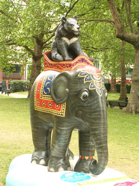
I am not sure of this next elephant - #243, Hope of Freedom.  Created by Sculptor Suzie Marsh, with the casting done by Carter Technical.  Artist's Inspiration: "I have long admired the animal welfare work of AnimalsAsia Foundation and am delighted to be able to support the moon bears through my work. This sculpture is a chance to raise awareness for two iconic threatened species."  This elephant is in aid of Animals Asia Foundation.  It is certainly different from the others, at least. 


This beautiful elephant #17, named Gaj Mani was created by Yodsaran Chaidungkaew.  This elephant is in aid of Sanskara Development Trust and Jim Corbett Trust.


This next elephant is lovely - #25, named I Miss The Forest and created by Wongpeera Winyarat. This elephant is in aid of Elephant Nature Foundation.  Isn't she pretty?


Here's Russell, #109.  He was commissioned by Graeme le Saux, the football player. 


This beautiful elephant named Will Only Words Remain, #134 was created by Jon Hicks.  Artist's Inspiration: "This is a collaboration with International Fund For Animal Welfare (IFAW) the work inspired by their 'Will only words remain' campaign which highlights how elephants are endangered through poaching".  This elephant is in aid of IFAW.


Not far to go now - #86, Polyphant - created by Daniel Chadwick.  Artist's Inspiration:  "I wanted to create a modern, tribal feel". 


Never Forget, #246, is next.  Created by Tom Hallifax, his inspiration: "Mehndi, tattoos, graffiti, targets".  This elephant is in aid of Save the Rhino.


Here's Tara, #112, created and sponsored by Mark Shand.  Artist's Inspiration: "Tara’ is the Asian elephant who enchanted the charismatic travel writer Mark Shand, and inspired him to help set up the charity, Elephant Family - the official charity of Elephant Parade worldwide. Tara, which means star in Hindi, is affectionately credited as the original founder of Elephant Family, so it was only fitting that she had an elephant designed in her name. Tara now lives happily at Kipling Camp, India, enjoying the affection and attention of many delighted guests each year. The excerpt that appears on the sculpture is from Mark’s award winning novel, Travels on my Elephant, which documented Mark’s journey across India with Tara. It describes the moment Mark fell in love with Tara; perhaps mirroring the feelings of many of the people when they see the elephants across London and inspiring them to join us in saving this incredible animal from extinction." 


And here's a great symbol of British culture - #44, Fish and Chips.  So funny!  This humourous elephant was created by Thammakit Thamboon.  This elephant was kindly sponsored by Lewis PR.


I was wending my weary way home, back to the tube station at Green Park, and here was #30 Vorsprung.  This beautiful elephant named Vorsprung was created by Storm Thorgerson and sponsored by Audi. 

Whew!  I am exhausted after all that - and that's just the editing!  Onto the big guns now - Westfield, and all the nelephants together at Royal Chelsea Hospital.