Search This Blog

Sunday 28 November 2010

Desktop Calendars

Each year, I try to devise a project that is both crafty yet practical - something that I can use up my hoarde of patterned paper, but something that will also make a pretty but practical gift. 

For me, I value things that have a purpose, and this is what I have eventually devised this year - after an awful lot of time procrastinating and trying to come up with a workable design!


This first calendar is for my mum.  She is really not a fussy person, and I know she will appreciate anything I send.  To this end, I took the opportunity to use up more scraps in my scraps bag, (the patterned paper is NME, and I remember exactly when I bought this - how sad is that?) and some of these really old stickers to make the year placque.  The calendar colour theme is blue, yellow, green and orange, so the colours don't really coordinate here, but they do with the whole theme of the calendar. 


The base is designed on a triangle to give the calendar stability and to allow it to stand on a desk.  The whole size is quite dinky at 3 1/4 inches wide by just over 4 inches long - space is usually a premium on desks, so I thought this was a really useful size. 

Here's another page - this time, using scraps of the Rouge de Garance I've used on some of my more recent layouts. 


The calendar page was stamped using a Kelly Panacci set of calendar stamps - the grid outline is common to all, and then there are separate month stamps.  I stamped each date individually (checking VERY carefully for next year's dates!) with my set of PSX individual number stamps, and they fit really well into the grid.  The stamping was the painful and a painstaking process, so I thought there must be a simpler way.  So I got some thicker card, and photocopied each month several times, reducing the overall size by 25% - the original calendar page was about 4 1/2 wide by 5 1/2 long, which started to get too big, in my opinion.  This size is much dinkier and cuter, and of course, uses less supplies! 


Whilst I greatly appreciate using individual scraps, in truth I really do prefer the look of coordinated projects.  The very masculine calendar above was made for my brother-in-law using mostly Basic Grey Granola, but I have also used a couple of 6 x 6 Life's journey pages which do coordinate.  I am not fond of this range from Basic Grey - most of it is really dark and drear, and I love bright zingy colours - but it is perfect for projects like this.  I bought two Basic Grey paper packs from a UKS sponsor for the princely sum of £7.99 I think, so how can you go wrong?  I gave half the pack to a friend, and the other half will happily make several calendars for Christmas for presents for male family and friends. 

I stamped next year using white embossing powder and Banana Frog's "teen" set - so versatile, and such a useful size. 

This last calendar is my favourite - and is for my sister.  I made the vast majority of it from scraps I had from the Fancy Pants Delight range - so happy and quirky.  I also coordinated it with scraps of WRMK White Out range - those little birdies are so adorable! 


I happened to have some Thickers in the perfect colour which coordinated really well.  I pieced together scraps and also dry embossed a design using a brass stencil.  I really like how this page turned out! 


I had a 12 x 12 page left of Journalling cards, which I would never really use, and turned out to be perfect sizes for the calendar pages.  I actually embellished this calendar, which I didn't do to the others - and just used some cut out leaves and little flowers! 

I started to use my Cinch as the binding tool for the project, and whilst I don't really regret selling my BIA for the Cinch as I think I will mostly want to do larger projects, the BIA is perfect for this type of project - the holes are neater, and it is better able to fasten smaller wires.  Thankfully, friends come in very useful to borrow tools where necessary!  I think this project might be something I repeat every year, and once you have the process down, they only take a few hours to make.  Still time-consuming, but worth it in the end! 

Thanks for visiting.  :)


Sunday 21 November 2010

More cards...

Here's another selection of cards I made to give away as Christmas presents.  My middle sister has three kids - two boys - the eldest is a teenager, the other two not so far away - so I made some cards suitable for the kids, and some just for her. 


Well - it looks all wonky in this picture, but I think it is straight!  Hopefully suitable for a teenage boy to give to a friend.  The chipboard water drop was left over from a recent layout - everything else is obviously leftovers. 

This next card is left over Anna Griffin paper, also using the negative diecut from my recent purchase of the Tim Holtz alterations die.  I borrowed the Tattered Florals die from a person at a crop recently, and used it to use up some left over fabric .  I attached it to the card using silicone glue.  The middle of the flower is a Martha Stewart croscomia flower, with a red cosmic shimmers spray dot in the middle. 


Much the same principle with this next one below  - this time I used the keyholes also.  The patterned paper this time is K & Co's Life's Journey 6 x 6.  The variegated flower is Hero Arts. 


For this next card, I used the left over piece of paper from the Taj Mahal DCWV's stack.  Very simple additions of plain cardstock, ribbon and a gem. 


I wanted to use some of these small patterned die-cuts - slowly, slowly the numbers are dwindling.  It was lacking something until I added the small red circles around the edge to add some pop.  They were just done with a hole punch.  The background colour is actually a light blue. 


This next card was made using - again!  the left over die cut from a layout.  I struggled for ages to use it on a card, but this is the result.  A bit weird, but hopefully someone will like it!


This next card is a mix of Fancy Pants Delight scraps, Rouge de Garance blue and We R Memory Keepers "White Out".  Hopefully suitable for a teenage boy!


Very similar principle for this next card - I think the die cut paper was Junkitz, again from yonks and yonks ago.  I am just determined to use up this odds and ends of stuff that I have sitting around. 


The spotted paper was Basic Grey - either Colour me Silly, or Skateshoppe - really can't remember which.  Couldn't get much more simple, though cutting out the pattern did take a little time. 

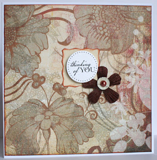
This piece of paper in this next card has stared at me for years - and last night I decided I couldn't stand to look at it for one more moment longer.  It has made four perfectly decent cards - and this is one.  Again, I grabbed these big flowers which I attached with silicone glue and added the round message and Stickles - that was it.  I must use all my extra large flowers in this way and get rid of them! 


This penultimate card was made using some vellum stickers.  I heavily inked around the edge with distress ink.  Added a couple of paper flowers for dimension, and some stickles on top.  Very simple, and I was very pleased to get rid of one more lot of packaging!


This last card is a bit nuts!  I had a precious scrap left of Basic Grey Phoebe, which is one of my favourite collections ever.  (A friend did give me a collection pack, so actually I do have a full set which I am hoarding ..... ) I put the American Crafts rub-ons onto this mint green circle, butit didn't look right, so then I had to cast about to put something together.  Tara loved it when she saw it - it is certainly one of more eclectic cards, but I think my sister Nerida will like it, hopefully. 


Well, so that's it!  A small selection of cards I've sent away to Australia.  I will probably share more Christmas cards next, then followed by a couple of layouts as the end of the month draws near.  Thanks for visiting!  :)


Thursday 11 November 2010

DH's Birthday

Was on 7th November .... he usually prefers a funny shop bought card (sacrilege!) but I decided I was definitely making him one this year. 


I used K & Co Mira patterned paper - the thermographic one.  Such beautiful colours and a lustrous sheen!  The bird and branch are Stampin' Up!  and very versatile.  I covered a tag with distress inks, and used my Martha Stewart iron gate punch down the left hand side.  Some cosmic shimmer mists onto the tag and some small heart punch outs to break up the line on the tag.  The folk heart charm I've had forever and it is fine when you give a card to a person - not so easy to post!  I painted the bird and the branch directly from the bottle of my Meadow Green Glimmer Mist - shame the sparkle and sheen is not more obvious.  He seemed to like it, and it was certainly admired by the guests who came to visit. 

Sunday 7 November 2010

Christmas Fayre

Someone commented that I seemed to be in production at the moment!  That is perfectly true, as it happens.  I have been asked to do a Christmas fayre at work, but never having done one before, I have no idea what will sell and what won't. 

To that end, I am making stuff that will otherwise be useful as presents from us!  I have decided to put together packs of cards to sell as I give these as a gift and they do seem to be well received.  People always use up cards they have and I don't think that will ever change. 

So I got to yesterday and put together this pack of 10 cards using left overs from Basic Grey Scarlet's Letter range.  I have always adored this range and really think you don't need to do much to produce a lovely card/paper gift. 


 Here I just added a DCVW self-adhesive ribbon, Doodlebug paper frill, a flower, and an MME embroidered brad.  I restocked my Craftwork Cards messages on QVC's craft day by buying 40 sheets of the messages!  Some are really naff, but I suppose that is bound to happen when you buy in quantity. I also prefer the black and white messages rather than the coloured ones so you are less restricted.  


What I also particularly love about this range is that it is very sophisticated, graphic and also unisex.  You could give almost any of these cards to either a man or woman and I am sure that they would be happy to receive them because of the beautiful paper design. 

To the card above I just added more Doodlebug paper frill, a Mrs Grossman's sticker border strip (I am determined to finish these up very soon!) and a felt flower from Making Memories, with a black card candy on top. 


Not sure about the one above - maybe a bit too severe but it's done now.  I had some white strips of Bazzill cardstock on my desk which I cut down with my Fiskar's scalloped scissors and then altered the colour with a Promarker.  I also bought a job lot of lace from Ebay about a year ago and it came with a thick edging on top.  I nipped that off and covered it with the red border strip. 


The special friend card above is probably my least favourite from the set.  It's a great way to use scraps, but doesn't work so well for me.  Still, it is perfectly acceptable in a pack, I think.  I am not so keen on the message either, but then I am very particular!

This next card is particularly suitable for a man, I think - it reminds me of being in a jungle/ or a rainforest! 


I am so pleased to have bought that Stampin' Up bird and branch punch - it is really versatile, and an elegant profile, I think.  I added a border strip and a sticker border edge for some extra interest - but I think the whole effect is very subtle, unlike some of the other cards!  I love these curvy messages too - there are some really nice sentiments in the pack which could be suitable for loads of occasions. 


You can't get more simple than the one above!  I really don't think it needs anything else. 

I just added a scrap piece of pink to add some softness and contrast to the card below, making it more feminine!  Here is where my circle and scalloped circle punches really come into their own. 


This next card is much more light hearted and flippant - I think it is the shape of the message and the colour in the card that does it!


Second to last one - you get the picture now!  I still think it is amazing how each card can change in flavour, mood and feel - even though you use much the same sorts of embellishments with the same range of paper. 

And finally!  A much lighter card in tone - and I really like it! 

  
Thanks for tuning in.  :)

Saturday 6 November 2010

Thrifty Christmas Crafting

I don't even know where I bought these stickers from, but when I saw that they were reduced to 49p, I bought two sets ....


And I thought it would be fun to show you what I created .... I still have a few miscellaneous little bits and bobs left from the sticker sheet, but you can stretch that one set of stickers a llooooongggg way ....

All of the accompanying background and matting papers are yeeeears old.  Good to get it used.  The above paisley paper got put into my Christmas stash because of the colours. 

When you know what to do, why do we then try to take a shortcut?  I was trying to deviate away from the white background for the vellum stickers, but what a mistake!  I knew that already.  In future, just stick to it!  Tsk. 


It's like a mantra - I will, I will get through that peel-off stash that I first bought when I started crafting!  I think the key is to keep the elements uniform - ie use gold peel-offs when you incorporate gold elsewhere. 


The red background was a really glossy dull red to which I added various shades of alcohol inks.  Being matted on a gold card just makes the red pop! I broke out my Krylon pens again, which I haven't used for a long time but smudging some gold around the edge of the stickers helps to tie them in with the background. 

A kind friend gave me some Christmas stash about a year or so ago, and there were a lot of Christmas metal messages from Making Memories in the package. Here I altered them with my gold Krylon pen so that they tie in with the gold theme.


I found a white oval in the christmas stash and stuck the Santa on.  I then misted over the top with a glimmer mist - but where there were patches in the masking, I filled in some of the background by painting with a paintbrush.  I love the misting painty effect here. 


Here I added some red sparkly tinsel fibre to get it used up! 

And now for something completely different.  This is the leftover piece of Sassafras Lass paper when I used the journalling spot inside.  I think it really portrays the ease of making a cute Christmas card using completely non-Christmas stash. 


And here's my favourite card from the pack.  I used my old trick of alcohol inking over used photo paper, and then embossing over the top with gold using a text Prima stamp. 


So - I think that stickers are a great embellishment to use, if you follow a couple of basic rules.  Happy thrifty Christmas crafting!


Thursday 4 November 2010

Grace at Caruso's

In response to our latest Sketch and Scrap challenge, we used this sketch below. 


I created this layout to fit two challenge criteria - one the sketch above, and the other set by Karen - to use papers from at least three different manufacturers, black and white, and some edging.


Here is my layout - and it is of my niece, Grace.  The photo was by one of those photographers who stroll amongst the tables whilst our family was dining in this stunning restaurant in Sorrento called "Caruso's", which is a tribute to Enrico Caruso, the famous tenor from Naples.


I considered this photo well worth buying, at 5 euros from the photographer, and thought he captured my niece very well - goodness me, so grown up here!

This meal was a highlight of our holiday and was just stunning!

I was very proud that I used all scraps, apart from cutting into one paper. I cut into the Crate Paper for the journalling block, but I used some ancient Scenic Route, Chatterbox, DCWV (Taj Mahal stack), Urban Lily and two lots of Basic Grey from my various scraps bags. I even rescued that left hand bracket from my scraps bag which was left over from a previous layout.

Two lots of edging down the left side and underneath the journalling at the bottom right. Black and white in the Urban Lily paper.

I really like how this layout turned out, considering I grabbed random scraps - I think the really funky colours of the Prima flowers help to bring it together. We were also challenged to use eyelets - so I used all the large red eyelets I had left on this page. I covered my wonky bashing of them with the Cropadile by using them as an extra layer for the flowers, and then sticking blue pearls on top! I used American Crafts Sixth Avenue stickers for the title, once again coordinating the colour by using my Promarkers, and then Glossy Accenting over the top to seal in the colour.

Must really be time for Christmas cards next, I think.  Thanks for stopping by!

Monday 1 November 2010

Scrapology November Challenge

This month our challenge was set by digi-designer Cindy Schneider from Canada.  Oh my, we are getting intercontinental! 


That is the marvellous thing about digi - so many beautiful layers and extra delicate accents.  Cindy's layout is so beautiful and delicate, but I tried my best with paper.  My layout weighs a tonne!  I did a right hand layout to a left hand side page here

The photos are of our family mucking about in the resort pool last January at Caloundra, Queensland (Aust). We had such a lovely time, just all being together. 


Supplies list:   Making Memories Turquoise Cardstock
                        Bazzill Dotted Swiss White cardstock, pink and
                        emerald green
                        Fancy Pants Summer Soiree stamps
                        Fancy Pants 12 x 12 chipboard
                        WRMK Sew Easy Scallop stitcher
                        Colorbox pigment inks
                        Stickles
                        Patterned Papers:  Rouge de Garance "fleur di tiare no5" ,
                        Sassafras Lass Pocket full of Rosies "Li'l Brudders",
                        unknown
                        American Crafts Thickers


The American Crafts Thickers title colour altered with pigment ink, embossing powder and Glossy Accents.  Some of those big splashes cover some other people and different distractions in the photos and is a trick I use quite often.  Every splash is handcut and outlined with Stickles, so it glitters a lot IRL. 

This layout took quite some time to come together and I am still not quite sure of it - I just loved the delicate colours of the original. 

Why don't you go check out what everyone else on the Scrapology team has come up with from this sketch?