Search This Blog

Wednesday, 5 December 2012

UKS Sketchy Scrappers Challenge - 1st birthday party invitation

There are a lot of crafty projects I create that never make it onto my blog - mostly of the card making variety. I quite often "knock-up" a card or two and never bother to photograph it - the process of photographing the card, and then writing up about it, can take quite a bit longer than actually making the card itself!

However, for this month's Sketchy Scrapper's layout on UK Scrappers, I decided to base a layout on one of my craft projects that I didn't want to forget - creating the invitation to my twins' first birthday party and saving the original on a layout. I was very proud of this invitation - I wanted to create a hand-crafted invitation, that was able to be reproduced in volume. I ended up sending 45 invitations - and when you have one year old twins to look after, that process ends up being time-consuming!

I have therefore swapped the photo with my master invitation. I have taken a few liberties with the sketch, and omitted the three floral vertical embellishments, because my title was too large and impeded on that space. I was really happy to use up the scraps of the Cosmo Cricket Storytime that I had left over from my previous two layouts - both the colours and the sentiments of the message tied in really well with my planning for this layout.

I utilised one of the Disney stamps that I bought on Ebay to make the invitations as an accent on the bottom right hand side of the page - I really dislike cutesy images as a rule, but I feel that you have to include some Disney characters in scrapbooks for the really young! Winnie - the - Pooh has remained one of my favourites since childhood and I am sure I will get a great use out of these stamps. I felt that Piglet and his attentive pose was the perfect finishing touch!

Even though the sketch was fairly simple, I still manage to fiddle and faff and take quite a few hours with each layout until I pull together something that I am happy with. I am pleased with the bright happy colours that have a slightly retro twist - I feel that this echoes the invitation and the occasion in general - and at least I have done something useful with the invitation - so that it is not knocking about my craft room, gathering dust!


Supplies:
Bazzill cardstock; Stampin' Up!  Whisper White
Patterned paper: s.e.i. "Mayberry" - Lime Rickey; Cosmo Cricket "Storytime" - Tweedle Dee and Striptease
Alpha Stickers: Pink Paislee "Fashion Script" by Holly McCaig; American Crafts "simply chic" runway
Punches: EK Success Scallop;
Shaped Scissors:  Fiskars Cloud
Stamp:  Disney "Piglet"
Ink:  Memento "Tuxedo Black"
Promarkers:  Cocktail Pink, Cerise, Rose Pink

Saturday, 1 December 2012

December Scrapology Challenge - Monochromatic

Hello everyone and welcome to December.  That's a scary thought, isn't it?  So much to do before Christmas .... This is Pam Thorburn's gorgeous layout we are scraplifting this month ...


When I saw Pam's gorgeous all white layout, I knew it would be very difficult to replicate anything so beautiful and with such a light touch! This photo of my twin boys' feet was taken at three days old, by the Bounty photographer when we were still in the hospital. As it was such a light photograph - mainly white - I felt it needed to be treated with some real contrast so that the photo would draw you in and not be lost on a white background. That is why I matted it with black cardstock and used a grey background. I was then happy to use white and light cream embellishments so that the layout was embellished with a light touch, yet retaining a fair bit of detail.


Supplies:
Bazzill cardstock - Black, white and grey
Making Memories tiny alphas - black on white
Tim Holtz #Sizzix decorative strips die - Tattered banners
Sizzix Framelits heart dies
Dienamics Leafy Flourish
HOTP Paper lace
Martha Stewart Punch around the page
Martha Stewart butterfly punches
Bird die cuts
EK Success medium corner rounder
Flowers - Prima, Making Memories and various
Rubons - Basic Grey Wholy Cow white lace border and other
Papermania pearl flower embellishments
White beads
Garlic bag!

The anchoring paper lace was one of the first scrapping materials I acquired - it was from a HOTP book of papers procured sometime in 2004 - so I am really pleased to have used this up - finally! Likewise with some of the Basic Grey rub-ons - I still have a shameful amount of these left, which really should be used, as they are starting to lose their "stickability".

I cut some of the Tim Holtz tattered banners from Lorraine Bilsby's crop sometime last year - she very generously used to bring her supply of dies, and I would sometimes be in the habit of die-cutting somethings in white card - and not always with a project in mind! It has proved very useful here - I think the tattered edge of the diecuts add some lightness to this part of the page.

Unfortunately, the photo is far from perfect - the developing has cut off part of an image of one foot, and there was a mark on the middle of the photo at the top. Fortunately, Pam's design used a heart as an anchor, with some butterflies on the photo at the top middle. Under different circumstances, I would have omitted this detail, but needed to replicate it here in order to cover up the mark.

Being in such a crucial stage of an international move - house is on the market, not yet sold, with belongings needing to be sorted and drastically pared down, I have given away all my bits of material and fabric and so now own nothing that is gauzy. I was stuck on this layout until my eyes rested upon the fine plastic mesh of the garlic bag - it was the perfect material from which to die cut most of a heart - the rest of it would have been hidden by the photo anyway, so it really didn't matter that I didn't have enough mesh to cut a whole heart. I glossy accented the heart to the base card, which also served to stop the mesh fraying and served another purpose - to adhere the while beads onto the mesh for a bit of impact.

I only own two of the Martha Stewart Punch Around the Page sets, as I felt that I wouldn't use them all too often - which has proved correct! I was very pleased to use the scalloped dotty border set in this layout, to add some lightness and some delicate detail to the border. I had a couple of practices with some scrap paper, but still made a mistake in one of the corners. Luckily, not too much of the white cardstock is showing, however - I simply cut another corner and patched it in. You can barely tell! I find the most important thing is not to make a mistake - but figuring out how to resolve it once the mistake has been made. I think that is how I've learned my biggest lessons in life - who said that art doesn't imitate life? :D

Why not set aside some time for yourself this month, in amongst all the preparation for Christmas, to get another page scrapbooked for an album?  Great to have a bit of normality in a crazy, crazy life ...

Monday, 12 November 2012

UK Scrappers Weekly Challenge - Make it Different!

Good morning folks; welcome to Monday and my own UK Scrappers weekly challenge. 

These challenges always consist of three elements and this week, they are to use:
  • a colour scheme that is unusual for you to use
  • delve into those scraps bags and use up some scraps
  • do something "arty"! (whatever that terms means for you)
I have directly scraplifted a layout that I really liked by April Foster called "Smile".  It was published in a "Create - Stamping" edition of Scrapbook Trends sometime in 2010 and I always admired it. 


I did lots of spraying with cosmic shimmer mists, and every piece of patterned paper has been used from my scraps bags.  The largest piece (behind the photo) is Cosmo Cricket "Tea for Two" range, called Tea Towel. 
 
I painted around the edge of each semi-circle with Cosmic Shimmers used like paint and added some stitching too - as I said - an exact scrap-lift of April Foster's.  Very different from what seems to be my style these days, but I like the end result - and I love to try new things - when I get the time! 
 
Lots of people have helped me create sample layouts over at UKS:
 
Jess, aka Jessbaby:
Ali, aka Alits:
Karen, aka Badgerleader:
Sarah, aka Scrappy-Sarah:
Jo, aka Wonky:
 
Thanks so much to them for their time and friendship in helping me out.  I will add blog links when I can later.  Why don't you have a go and join in with the challenge? 


Thursday, 1 November 2012

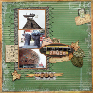
November Scrapology Layout - chicken wire and Lou Collins

Well, goodness, goodness, goodness!  Where has this year gone?  Welcome to a new month, and a new layout challenge at Scrapology.  This month, our newest design team member, Lou Collins, created this layout, and challenged us to use chicken wire:


Isn't this layout pretty?  Such delicate colours and the use of that size photo works so well here ....

This layout took me sooooo many hours - it probably doesn't look it, but most of the elements were handmade and I had to break it down to many, many stages.  For the longest time, I thought I would never finish, but I do believe in pushing on through adversity .... (queue rousing music here .... ) ha!
So, here is the result.  I distressed the green ledger paper with a combination of texture paste, and loads of different stamps, mostly stamped with white brilliance pigment ink. 


For the backing paper, I used a whole series of distress inks and stamps to give the layout some contrast and a bit more stability.  Every edge has been distressed with s.e.i. cocoa chalk ink which is a lovely dark chocolate colour. 
 
Because the background was so dark, I decided to experiment and colour the chicken wire with a black Promarker.  Apart from being a bit dangerous, it worked very well!  I didn't want to use brads to adhere the chicken wire down, so I used copious amounts of Pinflair silicone glue, with something weighty on top and some time overnight to make sure everything was secure. 
 
With the alpha brads, I cut off the long legs from the back, and again, stuck everything onto the label with the Pinflair glue.  I coated the brads with Glossy Accents to secure the finish - hence why you can't read the title, because of the tilt on the way they've stuck!  I used some ancient 7 gypsies paper and cut out the letters for the "Views" word. 
 
The antique stickers cover up a car that was in the picture of the sculpture - and again - everything was edged with cocoa chalk ink. 
 
Supplies:
Patterned paper:
  • Green ledger paper - love elsie "forrest - H2o" by ki memories
  • Basic Grey Granola "Seed"
  • 7 gypsies "Scrabble"
 
Stamps:
  • American Crafts "Sentiments"
  • Waltzing Mouse "Chicken Wire"
  • My Mind's Eye "Wild Asparagus"
  • Technique Tuesday "Postcards from Paris"
  • Fontwerks "Clear Ticking"
  • Stampers Anonymous - Tim Holtz collection "Odds and Ends"
  • Paperartsy "Ephemera Plate 2"
  • PSX "Celtic" alphabet stamps
Inks and Colouration Tools:
  • Brilliance Moonlight White Archival Pigment Ink
  • s.e.i. cocoa chalk ink block
  • Ranger Distress Inks: Wild Honey, Scattered Straw, Bundled Sage, Pumice Stone, Tea Dye
  • Walnut Stain,
  • Black Promarker
Embellishments:
  • 7 gypsies Gaffer Tape "Paisley Brown"
  • MM "Passport" metal clip
  • Letraset Helvetica Medium Condensed 3mm rub-ons
  • My Mind's Eye - Kraft "Funday" layered stickers
  • Label from K & Co "Re-Make" pad
  • Chicken wire
  • Sticko and K & Co "Life's Journey" antique postage stickers
  • Various Prima Leaves
  • Joanne's Courier Antique Alpha Brads
  • Tim Holtz Sizzix decorative die "Tattered Banners"
  • Tim Holtz Sizzix decorative die "Autumn Gatherings"
I do enjoy a challenge, and am highly relieved that I managed to finish this layout.  However - I don't think I will be working with chicken wire again - too lumpy, and too difficult to stick down.  Chicken wire doesn't have to be temperamental though - there are loads of lovely stamps available as a substitute.  Why don't you join in with this month's challenge and have a go? 

Jill at Cardinal Colours has come up with another fabulous prize this month:

WIRE!
1 pair wire cutters, 4 Prima Vines (wired) 2 wire embellishments, 3 wire frames and 4 inks - Imperial blue, orange, magenta and fresh green - wow!  You've got to be in it to win it!


Monday, 22 October 2012

Anniversary Card - Distress Inks

Hello!  I am sorry to say that the Distress Inks that I own have hitherto sat in the ink drawer, sadly underutilised.  When it came time to make a card for our recent 9th anniversary, I was rifling through my drawers of stash.  I came across some raw stamped images which I thought would be useful. 

Paul loves nature and outdoor pursuits.  I found these collage botanical and cow parsley images and decided to use them. 

 
I very simply coloured the cow parsley with Promarkers in quite a crude style.  I coloured the nature collage image by masking off each rectangle and then inking with various colours of Distress Inks - Scattered Straw, Wild Honey, Bundled Sage, Crushed Olive and Vintage Photo. 
 
I cut the ticket using the Sizzlets Framelits Tickets set and then also coloured with Distress Inks.  I used the Melissa Francis Sentiments set of stamps, stamped with Crushed Olive and then outlined with Promarker to soften the effect, which I like and think was very effective. 
 
I adhered the cow parsley image onto the card with silicone glue to add some dimension.  I was a bit pressed for time, and could have gone on to add something with even more dimension, but the card decided it was finished as it is! 
 
Really time to get cracking with Christmas cards, I suppose! 


Tuesday, 16 October 2012

Scrapology October Card Challenge

This month our sponsor is the lovely Shabana from Mei Flowers, please see here for her website which is chock full of delights.


The challenge is to create a card using the grid below, any 3 items in a line either across, down or diagonally. Of course you can add other elements too.
 
 
Thanks to Chrissy at Merly Impressions for the use of the bingo grid.  Here is my card:- I used layers, buttons and stitching on a male card. 


The rub-on is a really old one from Rhonna Farrer which I rescued, as otherwise I would have had to throw it away - which is just not me!  I will do all I can to use something wherever possible, and just disguise or live with any imperfections that may occur.  Part of the transfer had stuck to the glossy card, so I just rubbed the rest onto this surface, and then I coloured the background with Scattered Straw distress ink to blend better with the other colours in my card. 
 
I then just used various leaves - either diecut, or from patterned paper - to decorate the card.  Quite straight forward, really.  I hope you will join in with our challenge! 

Monday, 1 October 2012

October Scrapology Challenge - R is for Rainbow

Our Scraplift challenge this month at Scrapology was by Steph Devlin, with this really beautiful layout below:


I really scratched my head for the longest time, but it does feel good to push through the obstacles and finally get something finished that was a pretty big struggle. 

I started a layout having chosen a photo and some patterned paper and it really didn't work.  So back to the drawing board! 

The theme for this month is "R for Rainbow" so whilst I usually scraplift the layout and design, this month I used the theme instead of the layout and this is what I finally produced.


The title may be a bit weird, but that is the point - that love is the colour of the rainbow, ie all colours.  I used lots of scraps but also got out my heart stamps and punches - in fact, anything heart related! I glittered the hearts in the title and then glossy accented them so that the glitter would stay contained and neat and not shed over the layout or stick to the page protector. 

The photo was by the Bounty photographer and was taken of my boys at 3 days old.  We were given a page of passport sized photos and I used them to create birth announcements and thank you cards to send to people who sent gifts when they were born. 

Supplies:
Lots of scraps of patterned paper
"Love" Grosgrain ribbon (Courtesy of my friend Janet)
Tim Holtz "Typeset" Sizzix decorative strips alphabet
Stamps: "Fresh Mod" Fancy Pants, I Heart You Banana Frog, and various others

I also used lots of dimensional aspects like two heart brads, an orange button and the lovely folksie ribbon.  Some of the stamping details have been raised using Pinflair dimensional glue and the photos were raised onto foam pads.  This layout is quite weighty and does weigh considerably, despite its fairly flat appearance. 

I hope you have a go with the challenge - it is so interesting to see how everyone interprets the theme!  Once again, Jill from Cardinal Colours has been very generous, and awarded a rainbow coloured prize - you have to be in it to win it! 

Sunday, 16 September 2012

September Scrapology Card Challenge

Natalie O'Shea (now a Stampin' Up! rep) has set the September Scrapology card challenge - to make a Christmas card with unconventional products or tools not normally associated with Christmas. 

Come and have a look here at our website to see what the team came up with, but I struggled for ages to come up with something. 

 
In the end, I opted to go for scrapbooking supplies not normally associated with Christmas - I used patterned paper which reminded me of Christmas baubles and then the corresponding die-cuts.  The butterfly was very lightly patterned with a swirl design, which I stickled over with Stardust stickles - so that shimmer and shine has been captured in the photo. 
 
I used my trusty Quickutz snowflake die, and cut those shapes and also the tiny Martha Stewart butterflies from die-cut floral shapes.  I distressed the edge of the card using Tim Holtz "Bundled Sage" distress ink which went very well with the paper.  The message and snowflake circles were stamped using Christmas stamps Inkadinkado "Peppermint Twist".  I particularly like the greetings in this set. 
 
Supplies:
Crate Paper Mia "Sparkle" patterned paper
Crate Paper Mia die cuts
Quickutz snowflake
Bundled Sage distress ink
Martha Stewart butterfly punch
Stardust Stickles
Pinflair dimensional glue.
Inkadinkado "Peppermint Twist" christmas stamps (designed by Brenda Walton)

I am sure that there are many brilliantly creative minds out there who can come up with something more inventive, so why don't you join in with the challenge!  Natalie is donating a lovely prize of a new set of SU stamps, so you have to be in it to win it! 

Thanks for stopping by.  x

Tuesday, 4 September 2012

August Sketchy Scrappers layout

.... is all about Lewis!  Well, for the moment, anyway, until I get to do a companion to this page ...

Here he is, (almost) having his first swing at 13 months, on 1st September 2012.  He was very unsure at first, but soon loved it and was giggling and screaming with delight.  Probably my favourite picture I have taken of Lewis so far, as he normally looks quite serious in photos and here he is just having lots of fun. 


The biggest timewaster for me in this layout was choosing the papers. Once I worked out the configurations, the next biggest thing was trying to find some thing which represented flying through the air.  I didn't find anything suitable, so once I'd found the love elsie paper with the nature bits, I decided to just use those instead of searching further for anything more thematic. 

Supplies:
Bazzill Smoothie cardstock "Lime Zest"
Patterned Papers:
Cosmo Cricket Storytime: "Tweedle Dee" and "Strip Tease"
love, elsie: "Forrest Merit Badge"
Scraps of green Junkitz paper from aeons ago
Chipboard: Fancy Pants
Sticker:  Bella Blvd Plastino "Label Additions"

As I only had one of those chipboard swirls, I just duplicated it in cardstock and it doesn't really make any difference!  Pleased to use up more old stash, too. 

Oops - almost forgot - here's the sketch! So thanks to Jess.  Wasn't too sure about it in the beginning, but I think it's all about making it work for you. 

Thanks for stopping by, and if you're feeling blue, here's a tip - have a swing!  It really does make you feel better.  :) x


Saturday, 1 September 2012

September Scrapology Layout

Katharine Sutton (aka Sutty) used a Pagemaps sketch to come up with fantastic layout. 


Our challenge was to use hexagons and scraplift this.  I went back to the sketch and when I like them, tend to interpret them very literally. 

Here is her layout:-

 
I love all her arty, splodgy detail!  It is fab, and what great colours - so alive and energetic.  This is my layout below. 


I freehand cut the banners and once I was happy with the shape of one, just replicated it with the other five.  I rolled the top over the crochet thread and then glued it in place. 

I decided to go for broke with the hexagons and cut into five new bits of patterned paper which is really uncharacteristic of me.  But patterned paper is there to use and I put any paper I've cut into in my scraps bags.  I do go there a lot so decided it certainly won't go to waste!

I decided to use the shadow function on the Cricut font as otherwise the title would have been lost in the patterned paper. 

I am not happy with the splattering of the mist and really need to get more practise!  I've covered up most of it with the blue patterned banners in the bottom right hand corner.  I had a bit of a major spillage with the mist, so decided to use some of it to make a border for the page.  Then I wanted to blend it into the page a bit more, so went over the top with a long dotty stamp and some customised light blue paint.  Very minimalist splodging!


Ingredients:
Bazzill cardstock - Jetstream
Patterned Paper   - Sassafras Lass Serendipity "Blue Boutique" Exuberant
                            - Daisy D's Railway Journal
                            - Flair Red Roses
                            - Crate Paper Farmhouse Collection "Apple Pie"
                            - Cosmo Cricket Tea for Two "Tea Towel"
Cricut Cartridge  - Songbird
Bo Bunny "Snowflake" Jewels
Red Firefly Cosmic Shimmer Mist
Cream Crochet cotton
Jo Sonja acrylic paint
American Crafts "Sentiments" clear stamps. 

Thanks for stopping by.  :)

Wednesday, 15 August 2012

Scrapology August Card Challenge

Bev Rochester of Lili of the Valley produces digital stamps and kindly agreed to sponsor the August Scrapology card challenge using her designs.  There was an additional theme of "double" to also play along with. 

Here is my card. 


I picked out the blue flower on the patterned paper with twin blue floral embellishments.  The image was coloured in with Promarkers onto Whisper White Stampin' Up! cardstock which is a lovely substantial card.  I have tried to make the bunnies fur-like by varying the brush strokes of the pens. 

Ingredients:
Card Blank: Craftwork Cards
Whisper White cardstock - Stampin' Up!
Doodlebug Designs - glittery pink adhesive scallop sticker
Crochet Flower
Papermania Brad
Corner Rounder
Sweet Treats 6 x 6 patterned paper (a freebie with Papercraft Essentials)

Have a go and play along!  It is always fab to see what people come up with. 


Thursday, 9 August 2012

Our Friend Roberta

The following was the sketch for the July Sketchy Scrappers challenge over at UK Scrappers, chosen by Jules. 


Loved this sketch Jules - thanks so much!  I interpreted it rather literally.   


The photo is of our lovely friend Roberta with Henry and Lewis, taken at their first birthday party on 07.07.12.

I used plastic toothpicks as flag poles and washi tape backed with white card as the actual "flags". 

Supplies:
Patterned Paper  Fancy Pants "Love Birds" by Michele Colman
                          - Birds on a Wire
                          Scenic Route  - Background Blue Grid White
Cardstock         Cricut Cardstock
                          Bazzill
Ink                    Versafine "Deep Lagoon"
                          Versacolour "Scarlet"
Stamps             Imaginisce Lucy Bird collection "Flower Swirls"
                          Waltzing Mouse "Bitty Banners"
Die                    Tim Holtz "Typeset"
                          Spellbinders Shapeabilities "Nested Pennants"
Punch               Martha Stewart Butterflies

Washi Tape
Plastic Toothpicks
White Thread
Cobalt Thread
Cobalt Buttons

It took me so long to execute, as my sister and niece were camping out in my scrapping room so I had no access to my crafting supplies for nearly a month!  I am pleased to get my space back, but not so happy that they have gone back to Melbourne ... oh well.  At least I know it won't be long before we are much closer to them on a permanent basis ...


Tuesday, 7 August 2012

Sunday, 5th August 2012 - your first swim

Dear Henry and Lewis,

Today we took you for your first swim at Daddy's gym in Northwood.  It was Asha and Aunty Roslyn's last day with us, so it took two trips to get us all there in one car.  Mummy was very grateful for the extra help!


Mummy and Daddy weren't too sure about which flotation devices would help, so we tried everything in the course of the swim! 

Lewis, you were very unhappy through most of the experience, and only started to relax towards the end.  You were gripping onto us very tightly and the face below was the one we saw through most of the time in the water! 


Henry, you loved the whole experience and felt no fear.  Daddy called you "fish boy"! 


Luckily, Aunty Roslyn remembered to take her camera and she got these few photos for us, before being told by the lifeguard that she wasn't allowed to take photos.  


Henry, you got so confident that you even started to splash Daddy! 


We weren't able to take any more photos, but then we got some noodles and wrapped them around you, and Lewis, you started to feel a bit safer and enjoyed the swim more.  Getting you showered and dressed was quite awkward and fairly time consuming, but the process was helped by having a playpen in the family change room. 


We hope to take you swimming again soon, but that was a great and memorable experience.  


Wednesday, 1 August 2012

August Scrapology layout - N is for Netting

Welcome to August, and this month's Scrapology layout challenge! This month, we are scraplifting Toni Kelly, known as 2Dogs, whose blog is here:

Her Aunt Trina layout was the one chosen by the team, and the specific product we are using this month is netting. 


I loved the delicate feminine colours and details. The dimension of the distressed edges and the white on white texture are my particular highlights.  Wherever possible, I am determined to duplicate the layout only from supplies in my own stash for a couple of reasons: financial, and I have been gradually going through and rationalising what I keep ahead of our emigration to Australia next April. 


Supplies:
Bazzill cardstock
Patterned Paper - First Edition Up Up and Away
DCWV Vellum Quote stack "It's All about Boys"
Lace
Promarker
American Crafts Tulle Roses
Imaginisce flowers & jewelled brads
Tim Holtz distress ink "Peeled Paint"
Stamps  - Craftwork Cards "Butterflies and Blooms", "Graceful Grasses & Birdcages"
Zva Creative self adhesive crystals
Woodware double sided adhesive sheets
Paint - Jo Sonja Titanium White acrylic
Stampin' Up!  Whisper White Cardstock

Here's how:
I used a diecut sheet of patterned paper to outline the grey-blue Bazzill, and then cut around the edge with my Xacto knife.  I approximated the length of lace I would need to stitch around the border, and then coloured that lace in with a Promarker pen.  I will only ever buy white lace again, as this trick really minimises the amount of supplies you have to buy.  But being such a tactile hobby, sometimes you just fall in love with things you see, and buy them, even though they have no exact purpose at that moment! 

I had previously stitched around the border of the cardstock, but then stitched the lace to the page.  Once this was done, I distressed the edge, and curled it up using an embossing tool on a mat, "flicking it up" as I went around the border. 

I then cut the detail from a sparkly bit of one of the Up Up and Away papers and then lined up the vellum quote and cut the edges of the vellum so that the sparkly detail in the paper was not dulled.  I adhered the vellum to the paper using a Woodware double sided adhesive sheet.  Once this was done, I "buffed" the vellum so that it would be as clear as possible, with no air bubbles, thus giving a smooth finish. 

I knocked back the green swirly patterned paper by using white acrylic paint over the top.  This had been thinned down with glaze, so as not to detract from the photo. 

I stamped the birdcages and butterflies onto the Whisper White cardstock using Peeled Paint distress ink.  This meant that all the accompanying greens in the embellishments, ie the lace, flowers, stamped details and crystals coordinated beautifully. I cut down sections of the Zva crystals for the butterfly trails, as I never would have used such a large corner design on it's own. 

I adhered the embellishments onto the page using silicon glue, to allow for some dimensionality and more adherence.  I followed Toni's placement onto the page, trying to replicate it as much as I could.  My friend Sherri gave me the quote stack, and there are some really beautiful phrases and sentiments there and this was extremely appropriate for this gorgeous photo of Lewis. 

I was concerned whilst creating this layout that it would be too busy and cluttered, and that the elements wouldn't mesh together.  But the more I see it, the more finished it looks to me, and I finally like it.  That is the beauty of scraplifting!  Ending up with a layout you wouldn't have had otherwise.  Why don't you see what your end result would be, by joining in with our challenge?  We look forward to seeing you at Scrapology.  Thanks for dropping by.  :)

Sunday, 15 July 2012

July Scrapology Card Challenge - embossing

Marion Emberson from Sugar and Spice Crafts set the challenge this month - to use embossing powders. 

I have so many of them, and don't use them nearly often enough. 

This is the card I have produced. 


I started with the Craftwork Cards blank and covered it with Pink Bazzill cardstock.  All the other bits are from my pink scraps bag. 

Patterned papers are Papermania, SEI, and I used the smallest bits of Making Memories paper to create the banner - I thought it was perfect here! 

I embossed the greeting and the baby carriage in silver and then used corresponding accents, which the sun really picked up. My friend Fran recently had a baby girl and named her Cora - I hope she likes the card. 

The stamps are by Judikins and EK Success. 

Thanks for stopping by - and why don't you dust off your embossing powders and take the challenge?

Thursday, 5 July 2012

Sketchy Scrappers June Challenge - Annie's Letter

Jess set this month's sketch, which is below. 


I had to think about this one, and thought it would be more fitting for a heritage type layout.  I remembered that there was an additional layout that I wanted to do, on the other side of a photo of my maternal great Grandmother.  Some time ago, my mother gave me a photocopy of a letter from her grandmother to her on the occasion of my birth.  I've probably had the photocopy knocking about for seven or so years, so when time permits I will get a better and more pristine copy.  But for now, I am happy that I've preserved the memories in a safe and fitting place. 

I ended up turning the sketch 90 degrees left and took a bit of latitude to suit the layout.  Here is my finished product:


My friend Tara gave me a doily some time ago and I had used it previously as a mask.  I spritzed it with Teal and Sunlight Cosmic Shimmer mists so that the colour tied in with the patterned papers I wanted to use.  I folded up a sheet of 12 x 12 cream vellum to form an envelope for the letter and then for some added interest, I ran the completed envelope through the Tim Holtz "Postal" texture fades (embossing folder) with my Big Shot.  I really like that effect.  I stitched a button on but actually used a glue dot to adhere it together.  I used my Prima "Say it in Studs" swirl as a template and copied it onto acetate using a Promarker to spot out the placement of the gems and then glued them on individually.  That part was very time consuing and a real test of the eyes at night but I am pleased with the final result.  Luckily I had some other blue gems as I ran out of my original bigger sized ones and there is a slight colour difference but nothing which stands out dramatically. 

The great thing is now I can use up the left over bits of patterned paper and card and make some cards with the leftovers. 

Supplies:
Cream Bazzill cardstock
Cream vellum
Patterned paper:  Paper Adventures "The Vintage Workshop" in Slate:
                            Vintage Vines
                            Antique Brocade
                            Old Fashioned Floral
Tim Holtz "Postal" Texture Fades
Doily
Cosmic Shimmer mists: Teal Wash and Sunlight
Prima Flowers "Petite Mums Victoria"
Spellbinders Shapeabilities Nested Pennants
Crayola Gel pen
Martha Stewart punch
Blue Gems
Pearl on a String
Button
Lace
Ribbon

The journalling is rudimentary, but it reads:
Enclosed is a photocopy of a letter written from my Great Grandmother Annie to my mother on the occasion of my birth.  Dated January 1964.  She died 30th June, 1964.

A great challenge set by Jess, as it pushed me to finish something that was started many years ago.  Thanks for stopping by. 

Sunday, 1 July 2012

July Scrapology Challenge - Y is for Yarn

This month, over at Scrapology, we are once again looking to a fabulous layout by Gabrielle Pollacco, "You make me smile"  to scraplift. 


I particularly loved her colour choices, and the use of all the different materials and textures.  Whilst Gabrielle's work is known for her stitching and her distressing, I think the main point of interest on this layout is all the gardening embellishments, which are so cute! 

My starting point for this layout was the choice of papers.  My friend Heather recently gave me a collection of Daisy D vintage papers, which I am determined to use up so they don't malinger in my stash like most of my other supplies!  I cut half an inch off each side of the Lullaby Stripe paper and then inked around the border before stitching it to the Bazzill Dotted Swiss cardstock below. 

This adorable photo of Henry at just over two weeks old is another in the series by Lisa Roberts, a local photographer.  I have now scrapbooked the bulk of these pictures and it will be sad to see them end - but there will be many more waiting in the sidelines, of course.  I did originally paint and distress a matt for the photo, but it was somewhat distracting.  So I pulled a generic piece of check blue paper from my stash - I think it was from a paperpad my mother-in-law bought me when I first started scrapping - and then double matted with with cream cardstock found in that colour scraps bag. 


Funny how things look different on the screen - the large journalling block looks nearly too heavy for the layout, whereas it doesn't look that bad irl.  Still - it is my philosophy these days to use what I have on hand and not to buy additional things for layouts - so as the colour matched perfectly, I decided to use it! 

The quote is beautiful and was enough with this matching photo of Henry. 

"Reach high for Stars lie hidden in your soul. 
Dream deep, for every dream precedes the goal. "

Pamela Vaull Starr

I filled the gap between the photo and the Fancy Pants "Delight" Notebook Journal page with some more Daisy D's paper.  I added the ruler ribbon to emphasize the "reach high" aspect of the poem.  I used the Rhonna Farrer quote rub-on against some plain cream journalling patterned paper from my scraps bag, as I felt the maroon lines would be too distracting.  All other embellishments used were either from the Daisy D's collection, or found by rifling through my stash.  I thought the "wish" skipping stone went perfectly with the dark background of the photo - yet another thing I must have had for eight years from when I first started scrapbooking.  In fact, I think I remember buying these from Artbase on my first ever trip to a scrapbooking shop. 

Seeing as how our challenge was to use yarn, I had yet to incorporate it into my layout.  I took the string off a antiqued label from a Rusty Pickle bottle of buttons and glued it to the scalloped journal paper.  I still didn't think it was anchored, so I found two silver heart sequins, which I have coloured blue with a Promarker, and then glossy accented them to the page.  Hopefully it doesn't look too much like an afterthought! 

Supplies:
.  Bazzill Dotted Swiss cardstock, Papermania Natural earthtones cardstock (cream photo matt)
.  Daisy D's Lullaby Stripe and Nursery Alphabet patterned papers, large photo corner sticker, photo
   anchor sticker, yellow dotty file folder sticker, green dotty son sticker
.  Creative Imaginations cream journalling stripe patterned paper
.  Fancypants "Delight" Notebook Journal, "Powder" lace wrap, "Harvest" Fashion sense pin
.  Rhonna Farrer Rub-on Expressions
.  Making Memories "Animal Crackers" velvet brads
.  Queen and Co heart sequins
.  Rusty Pickle distressed string
.  Artemio "Boy" felt teddy bear and "baby" word
.  Teresa Collins "Ruler Ribbons" for Junkitz
.  Nostalgiques Paper Buttons by Rebecca Sower
.  Artistic Scrapper Skipping Stones by Shannon Watt
.  Sassafras Lass Paper Whimsies "Shindig"
.  Chocolate brown felt heart - unknown

It would be great if you would consider joining us at Scrapology and having a go at this month's challenge! Thanks for stopping by.  :)

Sunday, 17 June 2012

UK Scrappers June Week 2 Challenge

Karen set a challenge over at UK Scrappers this week to use this colour scheme from the Design Seeds website


I thought it was beautiful, so I decided to join in, if I had enough time.  I managed to scrape it in with just enough time to spare. 


I went to Chelsea Flower Show in 2009 and took scads of photos and have scrapbooked quite a few of them.  I still have loads to do, but somehow scrapbooking the boys has taken over! 

The challenge was to use a nature theme, three photos, and that colour scheme.  I thought I would keep the layout simple but use up some of the mountain of stash that I have accumulated. 

I stickles the spots on the butterfly and backed it and the sticker with white cardstock so that the colour was bright and crisp.  I covered the chipboard flower with "Poppyseed" patterned paper and the leaves with the green patterned paper.  I also used the olive green cardstock to give the flower more punch and also bordered the leaves in the same manner. 

No real techniques here - just another layout completed for my future album!

Supplies:
Bazzill cardstock
Maya Road Chipboard - flower and scroll, covered with Junkitz green paper in my scraps bag
Sticker - K & Co Juliana
Butterfly - Creative Imaginations 12 x 12 transparency
Patterned papers - K & Co Poppyseed
Tim Holtz "Typeset" Sizzix Decorative alphabet

Thanks for stopping by. 

Friday, 15 June 2012

Scrapology June card challenge - Vintage

This month, Hels Sheridan challenged the team to create a card based on the vintage theme.  That came quite easily to me, as I had this particular Paperstack out in an effort to use it up!


I made this particular card for my parents' wedding anniversary which fell on 27th April - their 49th anniversary! They have both had health issues over the recent period, so the message on the card was one I especially meant for them. 

The paperstack is "KOlogy" from K & Company.  I remember having a very specific project in mind when I bought it, several years ago, but then the project fell off the radar and life generally got in the way.  Years pass, tastes change, and now I am not really interested in doing heritage/vintage layouts unless it is for a specific purpose ....

The card is quite simple and came together quickly. I cut the background patterned paper and adhered it to the card.  Being a K & Co pad, it comes with lots of different tags and journalling spots.  I matted this tag onto some cream patterned paper, and then outlined the lot with green chalk ink.   The copper dots are Tulip fabric paint.  I was surprised to learn that it dots quite finely - crucial in this type of project.  I wanted something light reflective, so adhered lots of light green faux pearls onto the oval of the tag.  I stuck them on with liquid glue and used a pin to pick up a gem from the pile and place precisely onto the card.  This method is quite quick, once you've allowed the glue to go tacky, and the effect is very neat. 


Friday, 8 June 2012

55th Anniversary

Today is my husband's parents' 55th wedding anniversary.  What a marvellous achievement in this day and age!  When I found out that the gemstone which commemorates this anniversary is emerald, I made this card for them:


Quite a simple card, but I like it!  More importantly, I hope they do too - and have a lovely celebration.  Thanks for stopping by!

Supplies:
Basic Grey Motifica 6 x 6 pad
DCWV Christmas Stack (pine green card)
Ribbon
Waltzing Mouse Stamps (Vintage Labels 4)
Spellbinders (Vintage Labels 4)
Green Flower
Stickles
My Favorite (sic) Things Leafy Flourish Die-namics
Melissa Francis Stamps - greeting
Tim Holtz Alphabet die - Typeset

Tuesday, 5 June 2012

May Sketchy Scrappers Challenge - circle embellishments

Jess asked me to step in and choose a sketch when the scheduled person didn't oblige.  So after a bit of searching, I found this sketch on the internet which I really liked and thought was very versatile. 


This is a Pagemaps design, and was featured in October 2009.  How time flies!

I loved the simplicity and the clean lines of  the sketch so decided to stick very closely to it with this interpretation below. 


All of the embellishments are cut from one piece of paper, which is My Little Shoebox 2009 line "Enjoy Life".  This particular paper is called Slow Motion and I liked it so much, I think I have at least two sheets of it.   

The photos were taken by my mum and depict me feeding my twin sons at the same time, which is a bit of a skill to be developed!  It worked well, until they were too big to lie across the sofa.  I had a big white muslin on my lap in the top picture, so covered it up by undulating the circle embellishments. 

I loved the caterpillar - it goes so well with the feeding theme and had to include it here.  Unusually for me, it was a layout that I finished quite quickly and I am happy with the end result, too. 

I dusted off my "Opposites Attract" Cricut cartridge and cut out the word "feeding" using red paper.  Weirdly, though I have stocked up a bit on American Crafts Thickers alphabets, for some reason, I don't seem to use them often, so I was determined to change that on this layout. 

My journalling reads: " Whilst the midwives were visiting us during your first couple of weeks home from the hospital, Rosie went on holiday and Sam covered in her place.  You were due a bottle and Sam propped you both up on pillows and fed you at the same time – which was so fast compared to what I was doing!
This tandem feeding then continued until you were both too big to fit on the sofa! 
Photos by Grandma Brierley 23 July 2011"
One of the best parts of being in a sketch challenge group is that there are 10 different layouts to see that have all used the same sketch as inspiration.  It is fascinating to see the end result. 

Thanks for stopping by. 


Friday, 1 June 2012

June Scrapology Challenge - W is for White Space!

Welcome to June, and another new challenge this month at Scrapology!  We are lifting a fabulous layout by Ro Philippsen, who is on the design teams for My Little Shoebox, Doodlebug Designs, and Imaginisce. 

Here is her layout, which she originally scrapped from a Pagemaps Sketch. 


Here is the Pagemaps sketch.

I think her layout is stunning!  I love the clear crisp background (even with the misting and splodging) and the bright colours and graphic design of the papers. 

I normally lift from the layout, but this month I went back to the sketch and interpreted it very literally as I loved the design so much.  Here is my interpretation:


For something a bit different, I decide to do a Circle Journal entry,  as it was something I needed to do in any case, and it was also a happy coincidence that the sketch fit in really well with the smaller size format.  Trouble is, not so much white space left, but there is still some to fit the criteria, thankfully....

I used scraps of patterned paper from my scraps bag.  The background damask stamp is by Heidi Swapp.  The Ticket date stamp is by Tim Holtz, around which I added some twine.  In the absence of a border punch, I used a cropadile to punch a series of holes and then ripped through some of them to emulate a page torn out of a spiral bound notebook. 

I loved the red and white graphic paper, but if you look closely, it is Christmas paper!  I didn't think it mattered for this little snippet, but I should have actually covered up the word "christmas" :lol:

Here is the matching journal page. 


I was very pleased to have used up a rub-on from Royal and Langnickel that I've had forever! I put this page through my printer by testing the journalling on normal printer paper first, and then adhering the rounded page onto the printer paper with repositionable Herma.  I just had to work out very carefully how everything would fit onto the journal page, and after  lot of fiddling about am very pleased with the final product.

The colour scheme is very fitting this particular month, celebrating the Diamond Jubilee.  What a very special year it will be for this country, with the Olympics shortly to come to London the following month.  I am determined to make the most of this summer, which will hold even more special significance, as it will be our family's last one in the UK, before we emigrate to Australia early next year. 

But in the meantime, why not join in with our challenge at Scrapology?  I would love to see how you interpret the sketch and the artwork your produce.  Have a great month, and thanks for visiting .... enjoy your June!