Search This Blog

Tuesday, 24 August 2010

Card Commission

A colleague gave me a difficult commission for a birthday card for her husband - loads of white space, romantic, and an inspirational quote. 

Here's what I came up with .....


I am afraid I took a really rushed photo and was a bit crooked!  I started off by inking the border in green of the card and then drew over the top with a Promarker.  The leaf motif was stamped  in a mixture of distress inks and came through in a variety of browns.  I gave the image some contrast by outlining it with a light tan coloured Promarker.  The rub-on is from a tin of Rhonna Farrer rub-ons that I have had for some time.  The inking went a bit awry and I was worried about the final result, but fortunately, both my colleague and her husband really like the card.  Phew! 

Monday, 23 August 2010

Merry Christmas!

Following on from my last layout in response to the first Scrapology challenge, here is the companion layout.  I still really enjoy the unit and cohesiveness you can achieve from a double layout. 


Not much to this one, really - a LOT of photos on the page, but the challenge on UKS was to incorporate multi-photos, a celebratory event and some sewing.  This time, the sewing was of a handstitching nature - around the large sticker and some detailing on the stamped christmas ornaments. 

To unite the pages, I used the same colour combination, even though the reds of the background cardstock are different.  All REALLY old supplies - but very pleased to have used them up. 

Cardstock - a combination of Bazzill basics and Creative Imaginations "Pizzazzil"
Stickers - Rusty Pickle "Grinchmas"
Christmas Ivy stickers - Doodlebug
Prima raja centres
Miscellaneous christmas ribbon
Stamps - Inkadinkadoo

I stamped the christmas baubles in Adirondack pigment ink in Clover and added some detail with red scrapper's floss and a small red gem in the middle.  I raised the baubles with foam and clear pads for a bit of dimension.  Not much to it, really!  But at least the event is scrapped and constricted to a double page, with the bit of journalling on the other side. 

Blog Candy!

Win some fantastic blog candy here!  Just go over to the Scrapology blog and comment on the Halloween Blog Candy post, and become a follower of the blog - simples! 


It contains papers from Basic Grey's Eerie collection, Making Memories, Karen Foster and Reminisce. Cardstock form Coredinations and Bazzill. Stickers from Jolee's Boutique, Doodlebug Design, EK Success, Sandylion and Bo Bunny. Various ribbons, some themed, some plain, black lace and fibres. Buttons, themed and plain. Charms, brads, and eyelets. In addition Halloween die cuts from QuicKutz and Cricut, with words numbers and images.  Wow! 

Monday, 9 August 2010

A is for Apertures ....

... namely, Starbursts!  That is the first monthly scraplift challenge over at Scrapology, with a layout by Anita. 

I don't tend to do as many people focused layouts so this WAS a real challenge!  I have also done very few Christmas layouts, but I came across these photos of my mum and my niece celebrating her first Christmas.


All my Christmas stash is very old and this is the most ancient!  I was working my way through it for Christmas cards, but here it is, used on a page.  Someone kindly sent me a RAK of Christmas papers and bits many years ago, so it turns up here! 

I decided to keep the background simple as the photos are busy enough - I really should have made the circles bigger.  My niece grabbed the Santa hat off my mum's head, so my journalling reads " It has been Santa Grandma for many years now.  Seems like there has been a turf war, and the leadership has changed!" 

Papers, letters and stickers - Doodlebug, 2003.  I matted everything in that Kelly Green to give it some definition.  The "Baby" is using my Autumn Leaves freestyle alphabet, which was stamped, then embossed - some of it is coloured in white pen, and I stamped again onto scraps of patterned paper and used the inserts on the letters to give them a bit of impact.  Stitching done in the form of scrapper's floss round the edge of the baubles.  I even used the Christmas ribbon that was in the pack, too!

I do like the layout - it doesn't compare to some of the other stunning creations - but I strongly believe in using everything you have - even if it is out of fashion!  (Other personal references really not necessary, :lol!)

Till next month from Scrapology. 

Sunday, 8 August 2010

Announcing ....

Scrapology - Adventures in Scrapbooking!  How exciting to have been invited by Lynn to join - a site for monthly scrapbooking inspiration.   I am very honoured to have been asked, pleased to be in such great company, and quite frankly, scared too! 

We go live from tomorrow, and are hoping to have you play along too.  Ready - let's go! 

Saturday, 7 August 2010

Creating Cards

This first card used up some Poundland stickers my friend Tara donated to me.  I struggled to know what to do with them for a long time, because of their asymmetrical outline shape.  Then I decided that they needed to be used in a collage type fashion, with loads of texture and other elements.


Shame I won't allow myself to shop at Poundland anymore - cannot condone an organisation who supports child labour.  Bad company ethics, bad.  Tsk.  Not that I was a prolific shopper there, but they've still lost my business!

Stickles can only be a good addition!  I imagine this next card could be suitable for a man.  I used another one of my Asian images, and an alcohol ink background.  I also used some scrap lining from the paper lace, and coloured it in.  Along with some black butterfly trim, which I regretted buying at the time, until I started using it - then I loved it! 

Much the same sort of technique for this next card, but I cut some of the butterflies individually, and added some gemstones.  Most of the time I like bright happy colours, but I think the subdued tones work well here. 

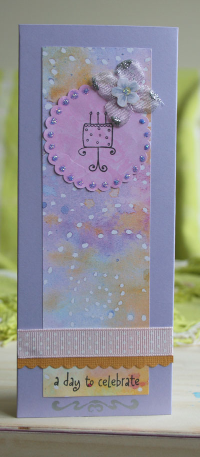
A bit of a change of pace - these card blanks were made because I had some spare tall envelopes.  This scrap of purple and mustard paper fitted perfectly - it looks like a twilight night scene, I think.  Colours are very pretty, in any case. 


This next card is my least favourite - it is a bit "clunky".  Never mind!  I used an image that Linda sent me years ago.  Good to have used them up!


Finally, I call these next two rustic farmyard vintage.  Fanciful, or what?  More subdued colours, a bit faded, washed out some inking, buttons.  Seem evocative of times gone by.  This next card is the female version. 


The final version is male - fewer embellishments, more graphic in style.  A great use of scraps, but they do evoke that "make and mend" philosophy, I think!  Who knows what I will post about next time? 

Thursday, 5 August 2010

Bog Garden

It's not a romantic title, but it is what it is. I wasn't going to call the layout "The Colonial and Foreign Investments Garden"! Are you getting bored of Chelsea Flower Show layouts yet? I'm not! I love doing layouts of flowers and gardens - so satisfying to be able to use different colours and create different themes, according to the subject.


Guess it is becoming an album now, they're so many piccies. I took part in a sketch challenge, and hence this layout placement.

I thought these papers were perfect for the really acidic colours in these photos. I actually had perfect ribbons and trims to match - serendipitous!

Papers are Collage Press "Fresh" - my motto is that of course you need to stockpile patterned paper - you never know when you need it! They were all double sided, so it was brilliant - this gave me so many permutations of colours and patterns. I scanned in the catalogue and then printed out the journalling onto the patterned paper. The layout called for 3 times 3 x 3 photos - but I couldn't crop these down anymore, so I adapted the sketch.

I had these old gel dried violet stickers from when I first started crafting - in fact, they were in the first QVC kit I bought - so though they look a bit naff, at least I've used them up. I used my promarkers to colour in the circle of punched paper behind them, as I originally tried white, but it was too stark. I was very pleased to have used these papers - I wondered what I was going to use them for!