Search This Blog

Thursday, 4 November 2010

Grace at Caruso's

In response to our latest Sketch and Scrap challenge, we used this sketch below. 


I created this layout to fit two challenge criteria - one the sketch above, and the other set by Karen - to use papers from at least three different manufacturers, black and white, and some edging.


Here is my layout - and it is of my niece, Grace.  The photo was by one of those photographers who stroll amongst the tables whilst our family was dining in this stunning restaurant in Sorrento called "Caruso's", which is a tribute to Enrico Caruso, the famous tenor from Naples.


I considered this photo well worth buying, at 5 euros from the photographer, and thought he captured my niece very well - goodness me, so grown up here!

This meal was a highlight of our holiday and was just stunning!

I was very proud that I used all scraps, apart from cutting into one paper. I cut into the Crate Paper for the journalling block, but I used some ancient Scenic Route, Chatterbox, DCWV (Taj Mahal stack), Urban Lily and two lots of Basic Grey from my various scraps bags. I even rescued that left hand bracket from my scraps bag which was left over from a previous layout.

Two lots of edging down the left side and underneath the journalling at the bottom right. Black and white in the Urban Lily paper.

I really like how this layout turned out, considering I grabbed random scraps - I think the really funky colours of the Prima flowers help to bring it together. We were also challenged to use eyelets - so I used all the large red eyelets I had left on this page. I covered my wonky bashing of them with the Cropadile by using them as an extra layer for the flowers, and then sticking blue pearls on top! I used American Crafts Sixth Avenue stickers for the title, once again coordinating the colour by using my Promarkers, and then Glossy Accenting over the top to seal in the colour.

Must really be time for Christmas cards next, I think.  Thanks for stopping by!

Monday, 1 November 2010

Scrapology November Challenge

This month our challenge was set by digi-designer Cindy Schneider from Canada.  Oh my, we are getting intercontinental! 


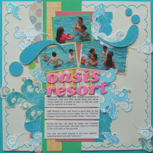
That is the marvellous thing about digi - so many beautiful layers and extra delicate accents.  Cindy's layout is so beautiful and delicate, but I tried my best with paper.  My layout weighs a tonne!  I did a right hand layout to a left hand side page here. 

The photos are of our family mucking about in the resort pool last January at Caloundra, Queensland (Aust). We had such a lovely time, just all being together. 


Supplies list:   Making Memories Turquoise Cardstock
                        Bazzill Dotted Swiss White cardstock, pink and
                        emerald green
                        Fancy Pants Summer Soiree stamps
                        Fancy Pants 12 x 12 chipboard
                        WRMK Sew Easy Scallop stitcher
                        Colorbox pigment inks
                        Stickles
                        Patterned Papers:  Rouge de Garance "fleur di tiare no5" ,
                        Sassafras Lass Pocket full of Rosies "Li'l Brudders",
                        unknown
                        American Crafts Thickers


The American Crafts Thickers title colour altered with pigment ink, embossing powder and Glossy Accents.  Some of those big splashes cover some other people and different distractions in the photos and is a trick I use quite often.  Every splash is handcut and outlined with Stickles, so it glitters a lot IRL. 

This layout took quite some time to come together and I am still not quite sure of it - I just loved the delicate colours of the original. 

Why don't you go check out what everyone else on the Scrapology team has come up with from this sketch?

Saturday, 30 October 2010

Banana Frog Blog Hop

Good morning good morning good morning!  I have no idea why I am feeling so chirpy, but it is an exciting day for me - today is the Banana Frog Blog Hop, and I am also featured this month as I was the guest designer for October. 

Today's theme is autumn and I have added my own twist to the interpretation.  I used the beautiful colours of autumn to make a layout instead about elephants (hmmm - random at all?  Naaaaa.....  :lol:) Earlier this year, I was involved in the ardent hunt  to capture the most number of elephants I could which were displayed around London as part of the Elephant Parade.  Most of them were sold off afterwards by auction which raised double the target - £4 million! to save the endangered Asian elephants. 

I found the beautiful decoration and design of the elephants very inspiring and will have great fun making arty scrapbook pages around these beautiful creatures, so with the theme of autumn colour in my mind I chose this particular elephant, Cha-Chang! to be the first model. 


Supplies:    Banana Frog Perfect Paisley  
                 (available now for a staggering £3.30!)
                 Banana Frog teen lower (also on special!)
                 Banana Frog Christmas elegance
                 American Crafts Tropical cardstock 8 1/2 x 11"
                 Tim Holtz Ideology - Paperie Journaling Ticket
                 Tim Holtz Sizzix Sizzlets Decorative Strip die - Ticket Strip
                 Twinkling H20's
                 Paisley ribbon
                 Versamark
                 Gold embossing powder
                 Ocean Sunlight Cosmic Shimmer mist
                 Turquoise Stickles
                 Jo Sonja Lagoon acrylic paint
                 A date stamp and smaller alphabet stamps
                 Scraps of cardstock
                 Lots of chalk inks!

I started off using this particular stamp from the Perfect Paisley set and embossed it onto the cardstock with gold embossing powder, which is perfect for Asian themes.  Paisley was also a very dominant theme in the Arts and Crafts movement, and to me it represents home comforts. 
                 
I stamped this all over the top right hand side of the page, and just used the leaf top as a stamping margin on the bottom of the page. 

Did you know you could turn part of a stamp into something akin to a border punch?  I took the journalling stamp from the Christmas Elegance set and used the bottom half to embellish underneath the photo.  This stamp also made a lovely background number embellishment as a plaque. 


This Chatterbox sticker alphabet is something that has been kicking around in my stash - probably for almost five years - and I kept looking at it, wondering how on earth I would use it.  I think it looks great here - sometimes it is worth banging stuff onto a page without too much unnecessary worry about how it will turn out!  Same with choosing the scraps, too.  Whilst I am not a huge fan of too many clashing patterns and colours, sometimes a bit of extra interest really adds some dynamism. 

I really like how this layout turned out - a mix of painty, a bit grungy, a bit blingy - not too clean!  But it still feels a bit folksy and "handmade" to me.  I think Autumn is a bit like that too - so an autumnal representation on a page, using a different subject. 

Thanks for stopping by on this first leg of the Banana Frog blog hop.  Make a comment here to be in with a chance of winning some lovely Banana Frog goodies!

Why don't you hop on over to Julie's blog, to see how she has interpreted Autumn?  Happy leaf gathering! :)

Wednesday, 27 October 2010

More Orange and Black Christmas Cards

Just two more from the series to share today ... once I'm on a roll, it is great to be able to continue until I have used up that piece of paper! 

Here is a very simple card I made using left over Basic Grey paper and the outside of the star Sizzix die cut shape.  I used the inside on another card. 


Perfect for a masculine card, or people who like very simple things.  I just topped the orange card with glitter glue, added a Craftwork Cards message, and that was it!


The focal point for this Joyous Celebration card was provided by one fluffy snowflake embellishment, layered onto a circle of black card.  I added one black card candy on top, and then glittered it!  Perfect cards to make for people who claim that they can't make cards.  Also very simple and striking, in my humble opinion!  Modern, too. 

Back soon with a different colourway! 


Sunday, 24 October 2010

Christmas cards Orange and Black

I had a fab day yesterday crafting with my friend Tara.  We both got into the Christmas card mood, and were quite productive! 

She got out various bits and bobs of Christmas stash to use, and she is always very generous to share.  Something that was in my Christmas box to use was orange handmade paper which I've had forever.  It's fun using non-traditional Christmas colours to make cards and this was a snazzy black/orange combo that I came up with. 


I recycled the silver square from another topper and cut out a snowflake from Tara's sizzix die, and then covered with black stickles.  I also recycled the black and white ribbon from a box of chocolates that I gave to my husband on Valentine's Day.  I also raided her black scraps bag and that stripey HOTP paper was perfect for a number of cards. 


Addition of black stickles around the border, graphic Christmas picture, and black card candy.  The orange hand made paper is a really intensive colour which shimmers - great texture, too!


I added a scrap of coordinating paper, the end of a Doodlebug paper frill which I altered to black from white, and cut out the Sizzix star and adhered onto the card with silicone glue - my new "must have" adhesive when adding dimension!  I've got a cheap bottle of glitter glue to use up which I bought when first crafting, and whilst it is much more gloopy than Stickles, it is more economical to use over a large surface.  Added another "card candy" over the top to act like a brad. 


For this last card, I used the lovely Christmas elegance Banana Frog stamps to emboss the snow flake onto orange card with black embossing powder.  I used the Sizzix die with a Craftwork cards message over the top for a very simple and graphic card. 

I made a few more of a very similar nature in the same colour way and I think this colour combination is very dramatic and effective! 

I have a commission for a pink Christmas card, so that will be my next challenge.  I shall have to see what raw materials I have in my stash and how inspiration strikes!

Thursday, 21 October 2010

Banana Frog Guest Spot Part 2

I am very conscious that Christmas is now under two months away! I am one of these strange creatures who likes making Christmas cards actually OVER the Christmas period, so I probably had at least half of them done by the middle of January. Since then, though, there has been almost non-existent progress, so once Bev from Banana Frog had sent me her lovely selection of stamps to create with this month, I knew it was overtime to redress the balance.

I decided to showcase just a small selection of the myriad techniques that stamping utilises, and highlight this gorgeous set of stamps called Christmas Elegance.

I have a particular thing about misting at the moment, so used a combination of misting, embossing and sewing on this first card.


The baubles were coloured in with Distress inks and then embossed with black to make them glossy. I used red handmade textured paper which adds more dimension, but the shimmery texture is unfortunately lost in the photo.

I see purple is quite a strong Christmas colour this year, and this next offering is like a blustery winter scene, using three different shades of Cosmic shimmers.


I think certain peel-offs have their place (used judiciously!) and I have added some textured snow to this scene with buttons and white Stampendous snowflake peel-offs. I used white dotty rub-ons around the border of the misted area to add contrast to the overall card. I added Stickles to the tops of the buttons, which unfortunately doesn't translate here.

There will always be a place for the traditional colours of red and green at Christmas.


The small set of Budmo Jiggler stamps are perfect for adding a greeting with a bit of bling - by adding tiny daubs of Stickles, I think this card has achieved that retro, glamorous Hollywood look of days gone by! The tiny red gems adhered to the stamped tree baubles were stuck on using Glossy Accents. I broke out my Marvy Le Plume pine green marker to add a border, which helps draw your eye into the card.

And last but not least - I broke out my alcohol inks for this last card, which is another vision of purpleness. This one is my favourite, especially being mounted onto a gold card, which I think adds extra sophistication!


I hate throwing things away, and love to recycle as much as possible. I use leftover photographic printer paper (which has had images previously printed on it) and overcolour this with alcohol inks. Using lighter shades of ink aren't successful here, as too much of the previous image shows through. Being that my main aim is limiting wastage, I think I gain a lot of interest because the image also has an interesting gradient of colour showing through and it adds depth to the background. I then overstamped with white brilliance ink for the branches and the snowflakes in dark purple. There are an additional three layers on this card, with the mica shard, the greeting and the ribbon. Lots of shiny shimmeriness on this Christmas offering, especially with the additional Stickles on the stamped snowflakes on the mica!

By having this one set of Christmas stamps, you can create a huge variety of different, elegant seasonal cards which will surely stand out from the crowd. By also mixing techniques and using different materials, this can really give your creative process a boost when making a large amount of cards at a very busy time of year.

Those were the Christmas cards that I showcased at the Banana Frog blog on 20th Oct.  I hope you enjoyed what I created!

Thursday, 14 October 2010

Splishy Splashy!

In response to this sketch below,


I produced this layout below. 


The photos are of our family mucking about in the resort pool last January at Caloundra, Queensland (Aust). Various patterned papers, Fancy Pants chipboard and Summer Soiree stamps, blinged with up Stickles. Detail like place name and date are still to be added eventually! American Crafts Thickers title colour altered with pigment ink, embossing powder and Glossy Accents.

I find it is a real challenge to work with these sized photos and not something I do as a norm.  I was relatively pleased with the way this layout turned out, and at least it is another layout completed for the album!

I have another layout due the end of the month for the Sketch and Scrap challenge, another layout for Scrapology .... something due for Banana Frog, and another commitment also.  Phew!  Struggling with a lack of mojo as well.... still, pushing through that obstacle is important to meet deadlines, so it's gotta be done!  Might have to set up a mantra like the little red wagon .....