Search This Blog

Showing posts with label alcohol inks. Show all posts

Saturday, 6 November 2010

Thrifty Christmas Crafting

I don't even know where I bought these stickers from, but when I saw that they were reduced to 49p, I bought two sets ....


And I thought it would be fun to show you what I created .... I still have a few miscellaneous little bits and bobs left from the sticker sheet, but you can stretch that one set of stickers a llooooongggg way ....

All of the accompanying background and matting papers are yeeeears old.  Good to get it used.  The above paisley paper got put into my Christmas stash because of the colours. 

When you know what to do, why do we then try to take a shortcut?  I was trying to deviate away from the white background for the vellum stickers, but what a mistake!  I knew that already.  In future, just stick to it!  Tsk. 


It's like a mantra - I will, I will get through that peel-off stash that I first bought when I started crafting!  I think the key is to keep the elements uniform - ie use gold peel-offs when you incorporate gold elsewhere. 


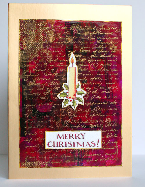
The red background was a really glossy dull red to which I added various shades of alcohol inks.  Being matted on a gold card just makes the red pop! I broke out my Krylon pens again, which I haven't used for a long time but smudging some gold around the edge of the stickers helps to tie them in with the background. 

A kind friend gave me some Christmas stash about a year or so ago, and there were a lot of Christmas metal messages from Making Memories in the package. Here I altered them with my gold Krylon pen so that they tie in with the gold theme.


I found a white oval in the christmas stash and stuck the Santa on.  I then misted over the top with a glimmer mist - but where there were patches in the masking, I filled in some of the background by painting with a paintbrush.  I love the misting painty effect here. 


Here I added some red sparkly tinsel fibre to get it used up! 

And now for something completely different.  This is the leftover piece of Sassafras Lass paper when I used the journalling spot inside.  I think it really portrays the ease of making a cute Christmas card using completely non-Christmas stash. 


And here's my favourite card from the pack.  I used my old trick of alcohol inking over used photo paper, and then embossing over the top with gold using a text Prima stamp. 


So - I think that stickers are a great embellishment to use, if you follow a couple of basic rules.  Happy thrifty Christmas crafting!


Saturday, 17 July 2010

Saturday snippets

I enjoy making cards, but sometimes I feel the need to shake things up a bit!  That's where techniques really come in handy. 

This first card was using my alcohol ink technique, but I love to layer up and add movement.  I really like how this card turned out.  I sent it to a friend who is currently going through a hard time and is stuck flat on her back in bed.  I hope it cheered her up a bit. 


The colours are subdued, but they all complement each other into a general richness, I think.  Loads of different bits and bobs on this forest green creation. 

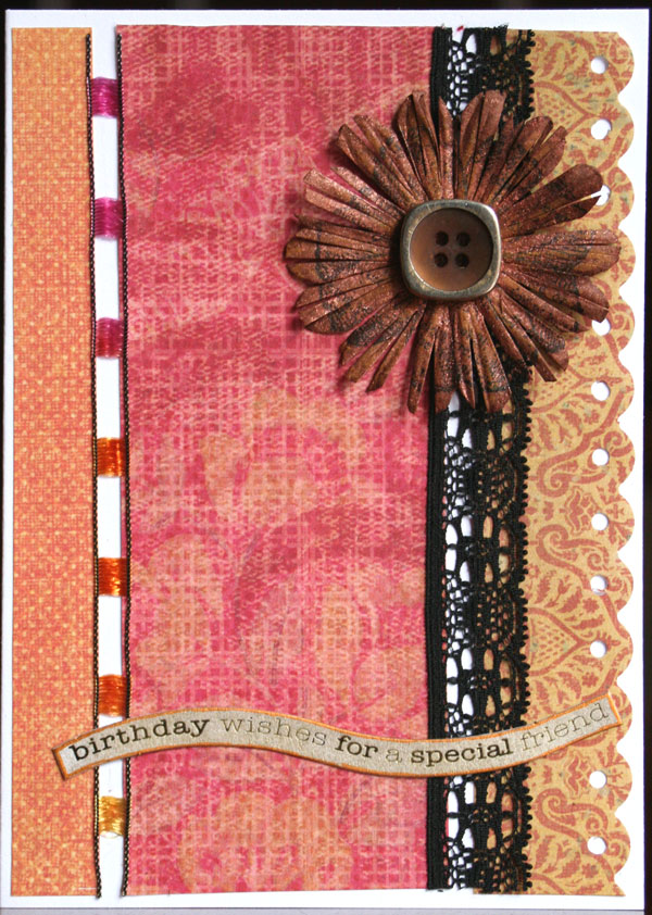
Here's some Indian spice!  I really like how this card turned out and it is one of my latest favourites. 


I've managed to use up some fibres (of which I have SO many).  I stamped on this flower in black Stazon, which was a plain boring dark brown.  I then added some yellow ink, and gave it a spritz with some bronze Perfect pearls mixed with some water.  It has a lovely sheen, which doesn't show up here.  I also cut into the petals and cut away some of the fullness of the flower, which totally changed it's appearance from a daisy into a crocosmia - much more satisfying!  The message was inked in gold, again which doesn't show up well here.  I love the hot spicy tones - delicious and with an exotic flavour!

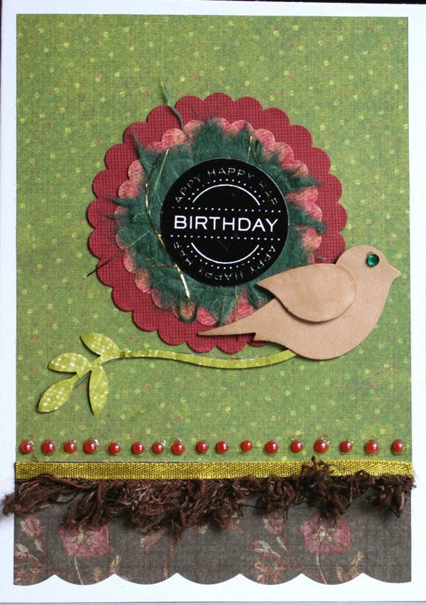
This last card is less unusual, but does use up some handmade paper, and again, some fibres.  I must start using them instead of ribbons - they can add some very interesting texture. 

The addition of the bird instead of a flower means that hopefully it would be suitable for a man, but it is still probably fairly feminine, with all the gem and scallop detail going on, I suppose.  The bird and branch punch is from Stampin' Up - I couldn't resist it, and it has already come in very handy for card making.  I will use in on a page eventually! I punched the figures using white scrap cardstock, and then coloured in the various elements with my Promarkers.  Both the last two cards used K and Co patterned paper which was scrap from the Birthday Book in Thursday's post.  It goes a long way!  I guess this next one is a bit more masculine, being less detailed ....


What do you think?  You can't see it clearly, but there is a dark brown fibre on top of the loopy detail.  It is cute and fluffy IRL ... still suitable for a man?  Yep.  I reckon.  Hmmm, now how else can I use up my stack of fibres in a non-naff way ....

Sunday, 27 June 2010

Cards and Alcohol ...

Inks, that is!  :lol:  Something to be said for catchy titles!  I have a friend who is just brilliant at thinking up really witty titles and they are so humourous - I really struggle, and may occasionally come up with something vaguely amusing.  I console myself with the thought that my talent must lie in other areas - I'm still waiting to discover it!  Ha! 

Anyhoo, a friend's birthday was coming up, and I decided to make her some vintagey arty cards, which is exactly her style.  She is not a card maker, but does heritage layouts with her seemingly endless supply of gorgeous family photos of ancestors. 

Living in my own little Alis world of delusion and fantasy half the time, I missed her birthday and had to scurry to make up.  (get the pun - ha ha!)

Here was her belated birthday card - made using alcohol ink on left over photo paper, embossed with shiny pink embossing powder, and then grunged up a bit with black pigment ink, heat again to set. 


I thought that Prima ribbon coordinated at the time, but now I've decided that it really doesn't!  I added silver accents.  That little gauze butterfly I received in a swap.  I don't even mind the dark image of the photo coming through the background.  It adds to the effect.  Shame that the photo paper pops and buckles with the heat coming from the heat gun - but again, I won't lose sleep over it.  On a mission to use all my left over peel-offs that I've accumulated too!  Some of them are quite decent, and look good in the right place, but most of them are just naff. 

Here's another card using those Crafty Individuals' images - love the ethereal quality some of them add. 


Also using up the stash of aperture cards my friend donated towards the charity cards.  They have temporarily stopped, because we've built up quite a collection - but then I will substitute my own card blanks for that, so it all works out the same in the wash, I think!  I stamped around the edges, and the gun metal frame for that Creative Imaginations image was from HOTP, which I've had for many years.  A scrap of punched out decorative edge finish the card off. 

Here's a friends card with a difference.  Linda sent me a sheet of vintage images some years ago, and I accented this very cute picture with some pink patterned papers from my scraps bag.  I don't throw anything away, which my groaning scraproom and my groaning husband would testify to! 


A very simple card.  I bought a kit from Craftwork cards a little while ago and received a pack of these curved messages.  I was a bit concerned that I didn't like them and would struggle to use them, but I think that it works really well on this simple card, and helps to avoid everything being too square.  I inked the message in pink chalk ink to coordinate, and job done! 

This next card could apply to both men and women - probably more men though I guess - made from more scraps and another one of those Crafty Individuals images. 


Unearthing things in your scraproom really helps - I've dug out my 6 x 6 pads which have been hiding, and now I am delving into them, in between elephant hunting, scrapping and domesticating, working etc ....  I used a friend's scallop circle punch, and colour coordinated this with a Promarker.  My colouring is not very even though, is it?  Pah ...

I used a left over rectangle from one of my alcohol ink backgrounds, and added it to a card ...


On reflection, I should have added some copper or gold for impact, as it looks a bit flat to me.  Another lesson learned! 

A friend gave me a sheet of green mirri card.  It really works well with this next card, I think.


That black lace, again given to me in a swap, really adds impact.  I had one of those happy birthday toppers left from a pack from Hobbycraft some time ago, and I glimmer misted some mulberry paper behind the image.  Otherwise, pink and khaki paper from scraps bag. 

Last card - I guess most suitable for a man ....


Alcohol ink background.  Collage stamp inked with white stazon.  A thin statue image triple matted - blue, Basic Grey pattern, then green mirri card.  Tara gave me the message, which I knocked back with a Promarker.  A small flower altered to Navy with a promarker, and then a green gem added to the middle, finish it off nicely. 

I love being able to adapt styles and themes to whatever suits your mood - one day vintage, the next day bright and funky, and then grungy ...

Monday, 21 June 2010

Tropical Cards ...

Hello viewers - I thought I'd give you a temporary break from animal matters, and thought we would try a flavour of papercrafting instead.  Some few weeks back, one of my colleagues from work left to take up a different position.  She was one of two card customers that I have at work, so I thought I would give her a small leaving gift that she could actually use. 

My friend donated some odds and ends of card blanks and envelopes.  She gave me six reddy pink envelopes of an odd size.  I got to and matched it as closely as I could to my Bazzill stash.  I ended up getting six card blanks from two bits of Bazzill, so that's really quite good, I think. 


The patterned paper is by Rhonna Farrer and has been sitting in my scraps bag for some time. I have had some of these dried flower gel stickers sitting in my stash ever since I began crafting, over six years ago!  These cards are all very simple, but effective.  Well, that was my aim! 


I have had loads of these K & Co tags sitting around also for years, trying to get used.  And then someone gave me loads of die cut squares and other shapes and after these few years, I've figured out a way of using them so they don't look too bad.  Nice font message stamps are a definite weakness of mine!                                                 


I am not adverse to using other people's scraps, especially when otherwise they would be thrown away! I taught a birthday book class last year, and one lady left all her scraps from this stack.  Far too pretty to be put in the bin! 


Much of a muchness, really but I think these cards all do stand on their own merit.  With paper as pretty as this, you don't need much else, but in the card below, I thought the alcohol ink matt goes really nicely for some colour contrast. 


This next one is probably my favourite - that paper is just gorg-e-ous .....


My friend seemed to like these little cards, so that was a good job.  Two posts in one day, but more ellies tomorrow, like it or not! 

Monday, 7 June 2010

Heritage Kitsch!

Is there such a thing - I dunno, but I think the following may be a good example .... Some time ago, my friend Linda sent me a sheet on photographic paper of some heritage images.  I am gradually using them up, but they need something suitably atmospheric to do them justice ...

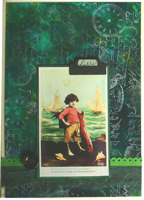
Here is an example of more of my pre-used photo paper, where I ink up the remaining section with alcohol inks, and use them in cardmaking.  Here I stamped over the top with white stazon ink using one of my collage stamps.  I like this effect and must remember to use this technique more often. 

I had previously cut out several embellishments using Quickutz dies in black cardstock, so I had one of these label holders lying around.  It was a wee bit fiddly trying to get a message in the window, but I managed it.  At the bottom of the photo mat I used some green handmade paper that I am trying to use up, and then Promarkered that white Doodlebug frill in green ink to coordinate.  You can't really see it here, but that button on the left is an old metal one - giving the whole thing a bit more grunge.  Nothing like a good bit of grunge sometimes, is there?  Thanks for visiting!  :)

Tuesday, 23 February 2010

Alcohol Inks

Like most crafters, I have stacks of products and purchases that have sadly been under-utilised.  Something that definitely falls into this category is my alcohol inks.  The biggest use I had made of these little bottles of fabulous colour is to blend onto left over photo paper and use on my cards. 

I hate waste, and often find that you only use half a sheet of A4 photo paper for a project.  I have gotten into the habit lately of using the rest of the sheet and making backgrounds with the alcohol inks.  My preference is a combination of 3 inks so that the colours blend better together.  Some gold ink was also "smooshed" in for some shiny contrast. 


The swirl was a left over piece of flourish that I cut on the Cricut machine, and covered with a cheap glitter glue my friend gave me, which I am trying to use up.  The flourish ribbon is actually transparent plastic backed onto white card to give it some pop!

This card is probably more my natural style, I suppose - I cut the leaf from a template, and stamped over the top in blue chalk ink.  These more "arty" cards are reserved for crafty friends who appreciate the techniques and time taken.  My trusty scallop punches come into play once again, along with a few flowers and a prima leaf.  My next series of alcohol ink cards will be a symphony in blue, so when I can start crafting again, stay tuned  ...