Search This Blog

Showing posts with label Basic Grey. Show all posts

Tuesday, 6 March 2012

Sketch and Scrap February

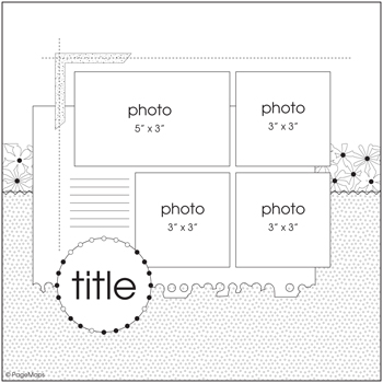
Here was the sketch I chose for the UK Scrappers social group, Sketch and Scrap. 


I like multi-photo layouts, but don't often adhere to the exact size of the picture according to the sketch.  I have copied the dimensions almost exactly, to do a layout of Lewis and Henry at seven months old.  The photos were obviously taken after eating something very orange! The photos were taken on 6th Feb, and were scrapped on 5th March - I am pretty impressed with that, I must say.  Wish I was as well organised as all that!  Because the photos matched the dimensions of the layout, I copied it pretty exactly.  I nearly took a short cut and used rub-on stitching instead of the real thing, but I wanted some extra punch with colour and dimension, so am pleased I went with the black thread in the end.  So happy to use up more old patterned paper and am happy with how the layout turned out - it is very unusual for me to only use patterned paper, and cardstock only as an accent under journalling. 


Supplies:
Striped paper - unknown - perhaps Chatterbox? (It is the same texture ...., tells you how old it probably is)
My Mind's Eye Bloom and Grow Collection "Bloom" 2009
Prima Iron Orchid Designs line, Mary Jane collection "Steel Toe" 2007
Prima Just Corina Designs, Dude Collection, "Roundabout" 2008
Journalling spot - unknown
Rub-ons - perhaps Basic Grey?
K & Company handmade Alphabet embossed stickers

I outlined everything with a fine black journalling pen, to add some impact.  I think it makes a subtle but important difference in terms of delineation.  You can see the uncertainly of Lewis by the expression on his face - he was going through a very wobbly period in terms of eating savoury - thank goodness he seems to be largely over that now!

Sunday, 2 October 2011

Scrapology October Layout

Welcome to October!  This month we are scraplifting one of Georgia K Keay's layouts, with the theme being "B for Borders". 


I was quite intimidated when I saw Georgia's layout because I knew I wanted to scrapbook my boys, but didn't want to splatter paint or ink or make it quite as eclectic as she did, even though I greatly admire the finished product.  In the end, I went with these photos as I knew I wanted to scrapbook them, even though they weren't marvellous, and thought that I could eventually make them work on a layout. 

Here is my layout:


Technique:
The layout is all about the bibs my mum bought the boys from Brisbane Airport when she flew over to be with us for the first month after the boys were born.  One bib had a picture of a pirate kangaroo and was emblazoned with "The Wild Ride" whilst the other was called the "Happy Turtle", depicted in the aboriginal art style.   The bibs are so cute and I wanted to remember their provenance so I decided to incorporate their design into the layout.  So I picked up the aboriginal art theme and thought that the Basic Grey Archaic papers were very suitably earthy.  I traced the kangaroo and turtle outlines onto acetate with a permanent marker and filled in the detail with Promarkers.  Then once the various patterned papers were stuck on, I decided to use the dot imagery for a border around the page to fit in with the Scrapology theme this month and also use the same principle to surround the journalling shape.  I liked the naive lettering on the bibs so just scribbled out my title and coloured in the letters using the same colour scheme.  After all, I can't cut up every item of clothing the boys have ever worn (as I did with their first baby grows)!  The splotches from Georgia's page are emulated with the dots in the border to look like air bubbles from the turtle and also the same with the fish. 

I outlined the patterned paper with my black Promarker to save on black cardstock, but did matt the photos on black Bazzill to give them more stability. 

My journalling reads " Grandma Brierley bought these bibs for you from Brisbane Airport because she said she couldn't resist them.  If you were crying a lot I would say to you "come on, my wild koalas, I want you to be happy turtles".  I don't know why you were called wild koalas where the picture was clearly a pirate kangaroo... @ 9 days old.  15-07-11".

Supplies:
Bazzill Basics cardstock
Patterned Papers:  Basic Grey - Archaic collection "Passe", "Fossil"
                               Crate Paper - Crate Avenue collection "Style"
                               Scenic Route - "Background Blue Grid Worn"
1/2" circle punch
Promarkers

As usual, Jill from Cardinal Colours is putting up a prize for the challenge.  Come on and join in!

Thursday, 1 September 2011

Little Stars

This is my first layout of the babies.  Part of the Sketch and Scrap challenge on UK Scrappers for August, and here is the sketch:


I turned the sketch on its side to account for my landscape photo.  I just had to scrapbook a photo of the boys - my first layout of them.  Thank goodness my friend Tara had cardstock that matched the suits!  My stock of Bazzill just wasn't bright or vivid enough. 


Journalling reads:
These were the first outfits Daddy bought for you whilst still in hospital.  You were scratching your faces and these baby grows from Mothercare had in built mits. 

I cut up one of the suits and saved the rocket logo and used some of the poppers as a type of brad.  I glued the fabric onto cardstock, and then made sure that after I cut out some of the aliens, I glued around the edge to stop the material from fraying.  The stars were made with a combination of punches and a Quickutz star die.  I still love my Quickutz - so handy to cut out small shapes when you just need one or two. 

I embossed some stars onto the background, and thought that the "little star" journalling block in the Fancy Pants Summer Soiree stamp set was perfect.  I just had to mask off the "s" to make the title suitably plural. 

I didn't have any embroidery thread in the appropriate colour, so I used some fibres.  I am determined to use up my ample stash of fibres some day - even if it takes me years and years! 

Supplies:
Stampin Up!  Cardstock Brights
Bazzill Basics
Basic Grey Lauderdale "Grass Stain/Lau"
Fancy Pants Stamps
White Embossing Powder- "Summer Soiree", and "Fresh Mod"
Uniball Signo White pen

It is my first completed layout for months and months - I had lost confidence and spent ages and ages completing it. Still, I am happy with the result and the subject has given me a renewed interest in getting pages completed fast! 

Scrapology September challenge - E is for Embossing

Well, I have returned from "maternity leave" :lol: and resumed joining in with the monthly challenges over at the Scrapology blog, where this month we have scraplifted a layout by Kelly Goree at Basic Grey. 

This is Kelly's layout below:


The technique this month was to use embossing, whether wet or dry.  I have interpreted the layout very simply below:


The image looks wonky, but it is not IRL! I cut out the kraft hearts with my Quickutz die, and then used a Cuttlebug embossing border with my Quickutz squeeze to create the embossing.  I wanted the layout to be quite simple so that the stunning Bounty photo of my boys was the centrepiece, but I did add detail by stitching around the embellishments.  Quite a combination of old papers used, which I don't think matters a jot! 

I used scalloped scissors to cut the blue dotty trim around the photo. Then I cut out one side of the border pattern from the Prima "Happy Go Lucky" patterned paper. Using a Bazzill "Just the Edge" strip as a template, I scalloped one edge of the My Mind's Eye patterned paper.

Supplies:
*  Bazzill Kraft cardstock
*  Bella Blvd Plastino "Label Additions" (family, heart sticker)
*  Chatterbox Scrapbook Walls collection "Spruce and Sky Paisley" patterned paper
*  Cuttlebug Embossing Borders "Just my Type"
*  Kaisercraft Squadron collection "Sergeant" patterned paper
*  My Mind's Eye Abbey Road Lucky Me Collection "How Fortunate" Title; Kaleidoscope Collection   Celebrate "Family" Journaling Card; Wild Asparagus cardstock collection patterned paper
*  Prima Marketing So Cute! Collection "Growing" (Apple of my Eye); Iron Orchid Designs Morning    Song Collection "Happy Go Lucky" patterned paper
*  Quickutz heart die A-SS-0001
*  Sassafras Lass Dreamy Collection "Tingle" patterned paper

Why don't you have a go and join in with us this month?  A lovely prize from Jill at Cardinal Colours is up for offer.  :)

Sunday, 7 November 2010

Christmas Fayre

Someone commented that I seemed to be in production at the moment!  That is perfectly true, as it happens.  I have been asked to do a Christmas fayre at work, but never having done one before, I have no idea what will sell and what won't. 

To that end, I am making stuff that will otherwise be useful as presents from us!  I have decided to put together packs of cards to sell as I give these as a gift and they do seem to be well received.  People always use up cards they have and I don't think that will ever change. 

So I got to yesterday and put together this pack of 10 cards using left overs from Basic Grey Scarlet's Letter range.  I have always adored this range and really think you don't need to do much to produce a lovely card/paper gift. 


 Here I just added a DCVW self-adhesive ribbon, Doodlebug paper frill, a flower, and an MME embroidered brad.  I restocked my Craftwork Cards messages on QVC's craft day by buying 40 sheets of the messages!  Some are really naff, but I suppose that is bound to happen when you buy in quantity. I also prefer the black and white messages rather than the coloured ones so you are less restricted.  


What I also particularly love about this range is that it is very sophisticated, graphic and also unisex.  You could give almost any of these cards to either a man or woman and I am sure that they would be happy to receive them because of the beautiful paper design. 

To the card above I just added more Doodlebug paper frill, a Mrs Grossman's sticker border strip (I am determined to finish these up very soon!) and a felt flower from Making Memories, with a black card candy on top. 


Not sure about the one above - maybe a bit too severe but it's done now.  I had some white strips of Bazzill cardstock on my desk which I cut down with my Fiskar's scalloped scissors and then altered the colour with a Promarker.  I also bought a job lot of lace from Ebay about a year ago and it came with a thick edging on top.  I nipped that off and covered it with the red border strip. 


The special friend card above is probably my least favourite from the set.  It's a great way to use scraps, but doesn't work so well for me.  Still, it is perfectly acceptable in a pack, I think.  I am not so keen on the message either, but then I am very particular!

This next card is particularly suitable for a man, I think - it reminds me of being in a jungle/ or a rainforest! 


I am so pleased to have bought that Stampin' Up bird and branch punch - it is really versatile, and an elegant profile, I think.  I added a border strip and a sticker border edge for some extra interest - but I think the whole effect is very subtle, unlike some of the other cards!  I love these curvy messages too - there are some really nice sentiments in the pack which could be suitable for loads of occasions. 


You can't get more simple than the one above!  I really don't think it needs anything else. 

I just added a scrap piece of pink to add some softness and contrast to the card below, making it more feminine!  Here is where my circle and scalloped circle punches really come into their own. 


This next card is much more light hearted and flippant - I think it is the shape of the message and the colour in the card that does it!


Second to last one - you get the picture now!  I still think it is amazing how each card can change in flavour, mood and feel - even though you use much the same sorts of embellishments with the same range of paper. 

And finally!  A much lighter card in tone - and I really like it! 

  
Thanks for tuning in.  :)

Sunday, 18 July 2010

Heuchera Display

Gosh, from the planning, to the finishing, this layout has taken me about 3 days .... I don't know why that is! 

Never mind, done now.  In response to a challenge set by Jimjams on UKS - use some of your oldest stash!  Well, that's not new for me, as I don't really stash discriminate .... :lol:  My friend gave me that piece of cream, gold and maroon patterned paper at the last crop, but in actuality, it is probably six or seven years old!  I refused to put it in my paper collection, as there it would sit, so I was determined to use it before it left my desk.  I've made about 4 cards from half of it, and there is still a 6 x 6 bit of it left ....


All other paper from my scraps bag, and is K and Co, and Basic Grey. I am also on a mission to use up some of my extensive fibres collection - so I laid some chocolate brown eyelash fibre underneath the loopy punch border of the circle so that the colour pops a bit. Lots of sewing on this layout, and I also used some bronze cosmic shimmers. Part of my Chelsea Flower Show 2009 series - I love all the colours and textures of the heuchera and my journalling is about them. I thought that the photo needed a matt, but used more scraps of paper underneath which gives some contrast to the photo.  Hmmm - need to do something with those leave and spray branches that I cut out ... maybe some more colouring around the edge, perhaps?  Thanks for stopping by.  :)

Sunday, 27 June 2010

Cards and Alcohol ...

Inks, that is!  :lol:  Something to be said for catchy titles!  I have a friend who is just brilliant at thinking up really witty titles and they are so humourous - I really struggle, and may occasionally come up with something vaguely amusing.  I console myself with the thought that my talent must lie in other areas - I'm still waiting to discover it!  Ha! 

Anyhoo, a friend's birthday was coming up, and I decided to make her some vintagey arty cards, which is exactly her style.  She is not a card maker, but does heritage layouts with her seemingly endless supply of gorgeous family photos of ancestors. 

Living in my own little Alis world of delusion and fantasy half the time, I missed her birthday and had to scurry to make up.  (get the pun - ha ha!)

Here was her belated birthday card - made using alcohol ink on left over photo paper, embossed with shiny pink embossing powder, and then grunged up a bit with black pigment ink, heat again to set. 


I thought that Prima ribbon coordinated at the time, but now I've decided that it really doesn't!  I added silver accents.  That little gauze butterfly I received in a swap.  I don't even mind the dark image of the photo coming through the background.  It adds to the effect.  Shame that the photo paper pops and buckles with the heat coming from the heat gun - but again, I won't lose sleep over it.  On a mission to use all my left over peel-offs that I've accumulated too!  Some of them are quite decent, and look good in the right place, but most of them are just naff. 

Here's another card using those Crafty Individuals' images - love the ethereal quality some of them add. 


Also using up the stash of aperture cards my friend donated towards the charity cards.  They have temporarily stopped, because we've built up quite a collection - but then I will substitute my own card blanks for that, so it all works out the same in the wash, I think!  I stamped around the edges, and the gun metal frame for that Creative Imaginations image was from HOTP, which I've had for many years.  A scrap of punched out decorative edge finish the card off. 

Here's a friends card with a difference.  Linda sent me a sheet of vintage images some years ago, and I accented this very cute picture with some pink patterned papers from my scraps bag.  I don't throw anything away, which my groaning scraproom and my groaning husband would testify to! 


A very simple card.  I bought a kit from Craftwork cards a little while ago and received a pack of these curved messages.  I was a bit concerned that I didn't like them and would struggle to use them, but I think that it works really well on this simple card, and helps to avoid everything being too square.  I inked the message in pink chalk ink to coordinate, and job done! 

This next card could apply to both men and women - probably more men though I guess - made from more scraps and another one of those Crafty Individuals images. 


Unearthing things in your scraproom really helps - I've dug out my 6 x 6 pads which have been hiding, and now I am delving into them, in between elephant hunting, scrapping and domesticating, working etc ....  I used a friend's scallop circle punch, and colour coordinated this with a Promarker.  My colouring is not very even though, is it?  Pah ...

I used a left over rectangle from one of my alcohol ink backgrounds, and added it to a card ...


On reflection, I should have added some copper or gold for impact, as it looks a bit flat to me.  Another lesson learned! 

A friend gave me a sheet of green mirri card.  It really works well with this next card, I think.


That black lace, again given to me in a swap, really adds impact.  I had one of those happy birthday toppers left from a pack from Hobbycraft some time ago, and I glimmer misted some mulberry paper behind the image.  Otherwise, pink and khaki paper from scraps bag. 

Last card - I guess most suitable for a man ....


Alcohol ink background.  Collage stamp inked with white stazon.  A thin statue image triple matted - blue, Basic Grey pattern, then green mirri card.  Tara gave me the message, which I knocked back with a Promarker.  A small flower altered to Navy with a promarker, and then a green gem added to the middle, finish it off nicely. 

I love being able to adapt styles and themes to whatever suits your mood - one day vintage, the next day bright and funky, and then grungy ...
Tuesday, 4 May 2010

Heuchera

I am really enjoying scrapping my Chelsea Flower Show photos from last year - I shall probably end up doing an album in the end. 


This was Beckie Dreyer's class called Oxford Street- using glimmer mists to make a background.  I only have two mists - one green, one cherry red - so used the Cherry Red Memories Mist, together with some Perfect Pearls spritzed in a mister and using some masks.  Those mists really do radiate widely - thank goodness I put down a lot of newspaper, but then a cream carpet is not perfect in a craft room!  :lol:

I thought the Heuchera with their black and golden foliage deserved a grungy layout and I am pleased with how this turned out. 

Products:  Basic Grey patterned paper, Prima Art Collage flowers, Basic Grey rub-ons, and Maya Road black transparent alphabet.  There is a layer of maroon lace underneath the misted background, which you can't pick out here - it adds another layer of colour IRL.  I won a beautiful card kit sometime ago, and that velvet scalloped circle went perfectly here for more texture. 

Friday, 16 April 2010

UKS Challenge

Well, it's something I do anyway, but in response to this UKS thread on how people use their scraps, I've made a few cards this week.  Sometimes my energy is a bit limited in the evening, so I tend to get up a bit earlier, and maybe make a card or two before leaving for work.

Here's something a bit different- I bought a Crafty Individuals People and Places 6 x 6 pack, which I shared with a friend.  They need to get used now, so with images that are that beautiful and detailed, the card really doesn't need much else.  The gold peel-off here looks fine in such a simple setting. 


See how many cards you can make from the leftovers of one sheet of 12 x 12 Basic Grey Skate Shoppe?  About time I boosted my stack of men's cards. 


That card in the middle was really made from dregs. About time I used up some of my eyelets!  Great for men's cards.  All very simple - but I do particularly like that one in the middle, considering the small scraps from which it was constructed!