Search This Blog

Showing posts with label K and Co. Show all posts

Sunday, 17 June 2012

UK Scrappers June Week 2 Challenge

Karen set a challenge over at UK Scrappers this week to use this colour scheme from the Design Seeds website


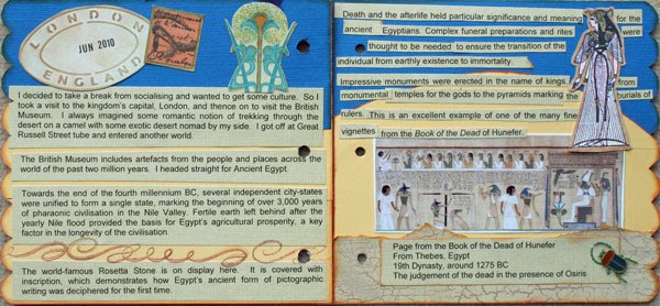
I thought it was beautiful, so I decided to join in, if I had enough time.  I managed to scrape it in with just enough time to spare. 


I went to Chelsea Flower Show in 2009 and took scads of photos and have scrapbooked quite a few of them.  I still have loads to do, but somehow scrapbooking the boys has taken over! 

The challenge was to use a nature theme, three photos, and that colour scheme.  I thought I would keep the layout simple but use up some of the mountain of stash that I have accumulated. 

I stickles the spots on the butterfly and backed it and the sticker with white cardstock so that the colour was bright and crisp.  I covered the chipboard flower with "Poppyseed" patterned paper and the leaves with the green patterned paper.  I also used the olive green cardstock to give the flower more punch and also bordered the leaves in the same manner. 

No real techniques here - just another layout completed for my future album!

Supplies:
Bazzill cardstock
Maya Road Chipboard - flower and scroll, covered with Junkitz green paper in my scraps bag
Sticker - K & Co Juliana
Butterfly - Creative Imaginations 12 x 12 transparency
Patterned papers - K & Co Poppyseed
Tim Holtz "Typeset" Sizzix Decorative alphabet

Thanks for stopping by. 

Sunday, 1 August 2010

Sculptor

Monthly challenge from one of my social groups on UKS - at least it gets me scrapping!

Another in my Chelsea 2009 series - I love sculptures and wire work, and I had to take some photos of these amazing copper and blue glass flower "sculptures". This is exactly the type of thing I would have in my garden, given the opportunity - and means to finance it, of course!
 

So - onto the challenge criteria - Something old - those Chatterbox Scrapbook Address letters - at least 7 years old, I'd say.

Something new - my DCVW Taj Mahal stack - bought to go with ellies, but I loved the yellow patterned paper, and this layout needed a touch of exotic brightness, I thought.

Something borrowed - the background blue paper is rouge de Garance - that I took from a minibook project I still haven't finished. Must do that at some point! Also, I used foiling, which is not USUALLY associated with scrapbooking - I used a faulty Zig pen to "leak" the ink, and painted my chipboard flower that way. Then added Zig glue pen over the top, and some Magic Scraps copper foil, and some other foil left over from a project. Laborious, but it was good this morning when I couldn't make any noise for about an hour when him indoors was falling asleep after night shift!

Something blue - lots of blue in this layout - the gem, the other patterned paper ....

Here's a close-up of that Fancy Pants chipboard flower.  The blue really shows through well.  The foiling was laborious, as it was small flakes, and I used two different types of foil ... one was just leftover flakes in a bag, but you can't let anything go to waste! 


I love how the foil glistens.  So does the paper, because it has so much texture - some glitter, and some raised detail. 

Here's my supplies list:

Magic Scraps Copper Foil Flakes
Fancy Pants Chipboard, "Delight" Journalling book
Chatterbox Scrapbook Address scarlet alphas, Prima 3D Alphabet stickers
My mind's Eye "Bloom and Grow" Felt Border
Patterned papers : rouge de Garance urbaine no5, K & Co Mira, DCWV "Taj Mahal" stack, "Green Polka Dot" by Karen Russell Narratives, for Creative Imaginations. 

A bit of a weird colour scheme for me - yellow and lime green, with the dark blue, maroon and copper!  Still, I like it and think it works.  The goldy yellow adds an exotic touch, and complements the sheen in the copper. 


That alphabet is weird - it has holographic properties.  One way looks as though there are vines, the next way, straight horizontal lines through the letters.  Looking from a different angle - they come up completely white - weird!  Thanks for your visit.  :)

Saturday, 24 July 2010

Egypt - Teddy CJ

I have finally gotten around to doing an entry for a teddy bear journal CJ that I am in.  I know it is safe to post, as my friend doesn't read my blog. 

I thought I would take photos and post straight away, otherwise I get a bit disorganised. 

We are supposed to have taken photos with the bear at the place we've chosen to go, but my entry today is a bit of a cheat.  I did intend to go, but didn't get there thus far, and really needed to send the bear on its way. 

I love the drama and mystery of Egypt, so I decided to have this bear, Bliss, go to the British Museum.  She is a very ladylike bear, in her crochet dress and pearls, so I thought a trip to Ancient Egypt was a nice break from afternoon tea parties and visiting with friends!


I just used scraps for the background, also printing on to patterned paper.  I've had some Jolie's Egypt stickers for ages and they came in very handy here.  I used my Graphicus stamps that I've had for years and years - the etching is extremely fine, and I was never happy with the way they stamped.  Until I tried stamping onto Whisper White cardstock from Stampin' Up - it made a world's worth of difference.  I coloured in the images with my Promarkers and Copics, using mainly the skin tones.  

I think my favourite part of my entry is the tag - I think my CJ entry is a bit messy as I didn't plan it very well, but  I was able to have more control with the tag. 

Tag front.  Scraps of K and Co, and a PaperArtsy stamp, coloured in with Ranger Distress Inks. 


Finished off with one of those Jolie's images.  Here's the back of the tag -


The tag was green, which I altered with Adirondack ink, and dried off with my heat gun.  Before I did, I added some gold embossing powder in a few judicious places, before stamping over the top with a Clarity stamp and another Paperartsy journalling stamp.  Finally, some chalk ink around the borders for a bit more definition.  A gold ribbon finishes off, with some Glossy Accents to stop the ribbon fraying.  That's all for now, folks!  :)

Sunday, 18 July 2010

Heuchera Display

Gosh, from the planning, to the finishing, this layout has taken me about 3 days .... I don't know why that is! 

Never mind, done now.  In response to a challenge set by Jimjams on UKS - use some of your oldest stash!  Well, that's not new for me, as I don't really stash discriminate .... :lol:  My friend gave me that piece of cream, gold and maroon patterned paper at the last crop, but in actuality, it is probably six or seven years old!  I refused to put it in my paper collection, as there it would sit, so I was determined to use it before it left my desk.  I've made about 4 cards from half of it, and there is still a 6 x 6 bit of it left ....


All other paper from my scraps bag, and is K and Co, and Basic Grey. I am also on a mission to use up some of my extensive fibres collection - so I laid some chocolate brown eyelash fibre underneath the loopy punch border of the circle so that the colour pops a bit. Lots of sewing on this layout, and I also used some bronze cosmic shimmers. Part of my Chelsea Flower Show 2009 series - I love all the colours and textures of the heuchera and my journalling is about them. I thought that the photo needed a matt, but used more scraps of paper underneath which gives some contrast to the photo.  Hmmm - need to do something with those leave and spray branches that I cut out ... maybe some more colouring around the edge, perhaps?  Thanks for stopping by.  :)

Saturday, 17 July 2010

Saturday snippets

I enjoy making cards, but sometimes I feel the need to shake things up a bit!  That's where techniques really come in handy. 

This first card was using my alcohol ink technique, but I love to layer up and add movement.  I really like how this card turned out.  I sent it to a friend who is currently going through a hard time and is stuck flat on her back in bed.  I hope it cheered her up a bit. 


The colours are subdued, but they all complement each other into a general richness, I think.  Loads of different bits and bobs on this forest green creation. 

Here's some Indian spice!  I really like how this card turned out and it is one of my latest favourites. 


I've managed to use up some fibres (of which I have SO many).  I stamped on this flower in black Stazon, which was a plain boring dark brown.  I then added some yellow ink, and gave it a spritz with some bronze Perfect pearls mixed with some water.  It has a lovely sheen, which doesn't show up here.  I also cut into the petals and cut away some of the fullness of the flower, which totally changed it's appearance from a daisy into a crocosmia - much more satisfying!  The message was inked in gold, again which doesn't show up well here.  I love the hot spicy tones - delicious and with an exotic flavour!

This last card is less unusual, but does use up some handmade paper, and again, some fibres.  I must start using them instead of ribbons - they can add some very interesting texture. 

The addition of the bird instead of a flower means that hopefully it would be suitable for a man, but it is still probably fairly feminine, with all the gem and scallop detail going on, I suppose.  The bird and branch punch is from Stampin' Up - I couldn't resist it, and it has already come in very handy for card making.  I will use in on a page eventually! I punched the figures using white scrap cardstock, and then coloured in the various elements with my Promarkers.  Both the last two cards used K and Co patterned paper which was scrap from the Birthday Book in Thursday's post.  It goes a long way!  I guess this next one is a bit more masculine, being less detailed ....


What do you think?  You can't see it clearly, but there is a dark brown fibre on top of the loopy detail.  It is cute and fluffy IRL ... still suitable for a man?  Yep.  I reckon.  Hmmm, now how else can I use up my stack of fibres in a non-naff way ....

Thursday, 15 July 2010

Rustic Birthday book

When I found out a colleague at work was raising money for three charities and is planning on trekking in the Himalayas later in the year, I went to her and offered to help.  I donated some handmade cards for her to sell, and I decided to make something for her to raffle off as a prize. 

I made this birthday book all from a K & Co collection which my lovely friend Moira gave me for my last birthday. 


The colours are very subtle on the cover, and unfortunately don't show up too clearly.  There is a lot of stamping on the cover, which I then covered with Eucalyptus stickles, so it does shine and sparkle quite a lot.  The title is "All Mixed Up" cut using the Cricut.  The letters were cut from Kraft card, which were then glossy accented and outlined with a dark brown pen so you could actually read the title. 

Apart from organising the papers so that the colour flows through nicely from one page to another, it's taken me many many tries to get the binding punching right.  With this book, it all finally came together, but then I quashed the wire badly in a few places, so it is a bit wonky! Oh well - the quirks and charm of a hand made article, I suppose.  


I didn't change the light settings, so unfortunately all the photos are overexposed.  Still, hopefully you will get the picture - ha ha!  I have popped six coordinating cards, made from the scraps, in the first lot of monthly pockets. 

  Here's just one of them to look at.  No doubting that these books are fiddly to make and time consuming, but they make very pretty and practical gifts and help to use up some of the patterned paper stash!  Using mount board for the covers has been the best material I've found thus far - both light weight but sturdy. 

Send me your details if you fancy a go at making one, and I will send you the full instructions.  Let me know how you've gotten on.  :)

Sunday, 4 April 2010

Happy Easter!

Here is a layout I made about two weeks ago.  I had taken a photo previously, but it didn't turn out in focus.  A lovely friend sent me a lens she no longer needed, so I spent yesterday making her something as a present which I will share after I give it to her. 

Here are some piccies I took at last year's Chelsea Flower Show - I just love wrought iron - the look, the arts and crafts/art nouveau era, so decided to scrap a double layout about the sculptures ...


I incorporated two challenges in one here. The first was to scrap about a gift, a handmade embellishment, and use an old but reliable tool. The gift was the ticket to Chelsea by my FIL - he didn't want to go. Handmade embellie - well, I altered the Bazzill Just the Edge strips by embossing them and inking and grunging up, then highlighting the edges with a copper pen. The old but reliable tool is my heat gun - I don't use it so much these days.


The second challenge was to use a dark base, use something not normally associated with scrapping, and use lots of bling. I used the dark purple, old potpourri, and the lots of bling was the metal flowers, sequins and stickles. I also used some jewellery fixings on top of the flower to layer up the metal. 

I have a whole box of metal embellishments yet to be used.  Here, the copper flowers were a pack of Becky Nunn.  The arts and crafts copper scroll bar is Architexture.  These have been sitting in my stash for about 5 years.  I layered up both branded and generic flowers, and was really pleased to also finish up a pack of layered K & Co dimensional paper flower stickers.  The Tattered Angels Glimmer Mist (Meadow Green, hat an appropriate name, lol!) doesn't show up so well but still adds some grunge. You can see it IRL. 

I shaded the flower below using my Promarkers - I use them much more for "altering the look" of things, rather than specifically colouring in stamped images.  I stuck bronze coloured sequins and stickles on top to add some unity to my "meadow" of flowers.  The K & Co patterned paper added some contrast to the purple.  I used up some Karen Foster metals by cutting out my title using my trusty Quickutz Squeeze and "Eliza" alphabet.

 I was trying to originally weave something with the fibres in the corners, but I regret adding that now.  You can see the glitter being shed off those purple velvet potpourri petals!  The black trim reminded me of wrought iron gates and was sent as part of a swap. I  love incorporating eclectic bits and pieces to add to the feel of a page - I think this might turn out to be one of my favourites.