Search This Blog

Showing posts with label prima. Show all posts

Tuesday, 6 March 2012

Sketch and Scrap February

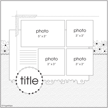
Here was the sketch I chose for the UK Scrappers social group, Sketch and Scrap. 


I like multi-photo layouts, but don't often adhere to the exact size of the picture according to the sketch.  I have copied the dimensions almost exactly, to do a layout of Lewis and Henry at seven months old.  The photos were obviously taken after eating something very orange! The photos were taken on 6th Feb, and were scrapped on 5th March - I am pretty impressed with that, I must say.  Wish I was as well organised as all that!  Because the photos matched the dimensions of the layout, I copied it pretty exactly.  I nearly took a short cut and used rub-on stitching instead of the real thing, but I wanted some extra punch with colour and dimension, so am pleased I went with the black thread in the end.  So happy to use up more old patterned paper and am happy with how the layout turned out - it is very unusual for me to only use patterned paper, and cardstock only as an accent under journalling. 


Supplies:
Striped paper - unknown - perhaps Chatterbox? (It is the same texture ...., tells you how old it probably is)
My Mind's Eye Bloom and Grow Collection "Bloom" 2009
Prima Iron Orchid Designs line, Mary Jane collection "Steel Toe" 2007
Prima Just Corina Designs, Dude Collection, "Roundabout" 2008
Journalling spot - unknown
Rub-ons - perhaps Basic Grey?
K & Company handmade Alphabet embossed stickers

I outlined everything with a fine black journalling pen, to add some impact.  I think it makes a subtle but important difference in terms of delineation.  You can see the uncertainly of Lewis by the expression on his face - he was going through a very wobbly period in terms of eating savoury - thank goodness he seems to be largely over that now!

Tuesday, 23 February 2010

Alcohol Inks

Like most crafters, I have stacks of products and purchases that have sadly been under-utilised.  Something that definitely falls into this category is my alcohol inks.  The biggest use I had made of these little bottles of fabulous colour is to blend onto left over photo paper and use on my cards. 

I hate waste, and often find that you only use half a sheet of A4 photo paper for a project.  I have gotten into the habit lately of using the rest of the sheet and making backgrounds with the alcohol inks.  My preference is a combination of 3 inks so that the colours blend better together.  Some gold ink was also "smooshed" in for some shiny contrast. 


The swirl was a left over piece of flourish that I cut on the Cricut machine, and covered with a cheap glitter glue my friend gave me, which I am trying to use up.  The flourish ribbon is actually transparent plastic backed onto white card to give it some pop!

This card is probably more my natural style, I suppose - I cut the leaf from a template, and stamped over the top in blue chalk ink.  These more "arty" cards are reserved for crafty friends who appreciate the techniques and time taken.  My trusty scallop punches come into play once again, along with a few flowers and a prima leaf.  My next series of alcohol ink cards will be a symphony in blue, so when I can start crafting again, stay tuned  ...

Tuesday, 16 February 2010

First Post!

After refusing to jump on the blogging bandwagon and resisting it for a good few years, I realised the futility of the struggle, and have finally given in!

It's taken a week to do some research by looking at other people's blogs and try to find information on line, but here we are - I am here to stay, and ready to share with the world - or whoever's interested enough to visit, in any case.

What an auspicious day for a first post - not only Valentine's Day, but my mother-in-law's birthday! That's why it is rather late for a very first post - still a challenge to get more organised in this life.


Here's a quick layout I did last night/this morning - I was a bit time poor, but really wanted to support a friend, by entering a competition she was running, so I decided to make a bit of an effort at the last minute!
I finally got around to using the Fancy Pants "Whirl" transparency from about 2007, not that I really care much about the age of my stash. I felt it didn't need much adding to it, but to remove some of that really linear quality, I used a shaped piece of cardstock as a template to alter the shape.I took this photo of my mum and niece in the pool on my recent trip to Australia for Christmas this year. It's photographed quite well, apart from the camera flare at the top of the page. I have been waiting to use this wired spotty glitter ribbon for ages now, and I think it works here. The quote and flower stickers are Cloud 9 and some Prima bling and I think the stamping with Hero Arts just finishes it off!

You'll have to give me an opinion on the title of my blog! I had no idea what I was trying to say (which, for those that know me, will say that's pretty usual). Stay tuned!